Range Slider
What is the Form Range Slider?
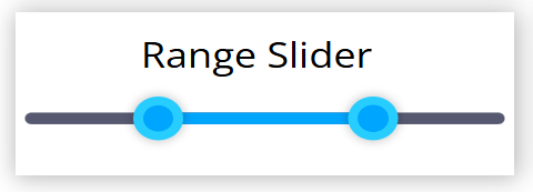
The Range Slider lets the user pick a numeric range using two thumbs, a lower and an upper one. The filled part of the track spans between the two thumbs, and a bubble shows the value of the thumb being dragged.
Options
Minimum value
- The lowest value either thumb can reach (the left end of the track).
- Default:
0.
Maximum value
- The highest value either thumb can reach (the right end of the track).
- Default:
100.
Step value
- The increment the thumbs snap to while dragging.
- Default:
5.
Min default value
- The starting position of the lower thumb when the slider first renders, when no value is supplied by a datasource or an external message.
- Default:
25.
Max default value
- The starting position of the upper thumb when the slider first renders, when no value is supplied by a datasource or an external message.
- Default:
75.
Color
- The primary color. It is used for the filled portion of the track (between the thumbs) and the thumbs.
- The thumb border is derived from this color automatically (lightened or darkened depending on whether the primary color is light or dark).
- Default:
#00a5fe.
Background Color
- The color of the unfilled (background) portion of the track.
- Default:
#565970.
Slider size (px)
- The thickness of the track.
- Range:
1to50. Default:8.
Thumb size (px)
- The size of the draggable thumbs.
- Range:
1to50. Default:8.
Thumb radius (%)
- The corner rounding of the thumbs, as a percentage (
50%produces circular thumbs). - Range:
0to50. Default:50.
Range radius (px)
- The corner rounding of the filled track range between the thumbs.
- Range:
0to18. Default:4.
Range Slide disabled
- When enabled, the filled middle section can no longer be dragged to move both thumbs together; each thumb must be moved individually.
- Default:
false.
Lower thumb disabled
- When enabled, the lower thumb is locked in place and cannot be moved.
- Default:
false.
Upper thumb disabled
- When enabled, the upper thumb is locked in place and cannot be moved.
- Default:
false.
Suffix
- A short text appended to the value shown in the dragging bubble (for example a unit such as
%,kg, orpts). - The suffix is display only. It is not part of the stored value.
- Default: empty.
Setting Mock Field and Own Value
The Range Slider stores both thumb positions. The Own value is a string in the form {lower}-{upper} (for example 25-75), while the form field value is an object { minimum, maximum }. It updates the Mock and Own values when:
- The widget is rendered (using the datasource value if present, otherwise the configured Min default and Max default values).
- The editor settings change.
- Either thumb is dragged (on every input).
- An external message tells it to change, clear, or reset.
The export is debounced (about 150 ms) and only happens on the displayer. Exporting also broadcasts the value as a sensor event named after the field (see Sensor Events), unless the update is silent.
Validation
The Range Slider does not validate itself.
Sensor Events
-
The Range Slider does not validate, so it does not send a
{FORM-NAME}-validevent. -
Whenever the value is exported, the field broadcasts a sensor event named after the field, carrying the current range value:
{FORM-NAME} value: { minimum, maximum }This broadcast is suppressed when the change comes from a silent Clear or Reset.
External Messages
The Range Slider listens to the three basic external messages:
- Set Form: Reads the
valueparameter and splits it on a semicolon or a space into exactly two numbers, the lower and the upper bound (for example20;80or20 80). Both must be valid numbers, otherwise the message is ignored. Moves the two thumbs accordingly and updates the Mock and Own values. - Clear Form: Re-initializes the thumbs to the configured Min default and Max default positions. Updates the Mock and Own values silently.
- Reset Form: Behaves the same as Clear Form, returning the thumbs to the configured Min default and Max default positions silently.
Value from Datasource
- When the slider is rendered, if the bound form output datasource already holds a value for this field, the thumbs are initialized from that value's
minimumandmaximumproperties instead of the configured Min default and Max default values.