Intro
This article introduces you to our custom MeetingRoom app and its core features.
The Meeting Room app is deployed to customer servers per request. To learn more contact our support at sales@wallboard.info!
This custom app is under active development and any information in this documentation could be inaccurate or outdated!
If you have any questions please contact our support at support@wallboard.info
What is MeetingRoom?
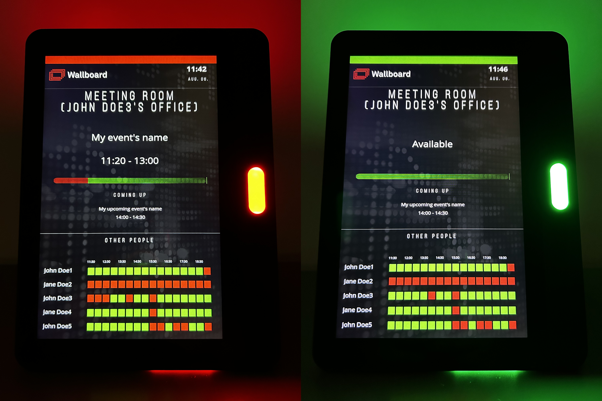
With the MeetingRoom custom app you can easily keep track of your schedule and display it onto a screen so your coworkers and customers always know when you're available. You can even create a room booking function using standard widget features. MeetingRoom is able to control the LED lights of compatible media player devices as well.
Prerequisites
To utilize the functions of the MeetingRoom app you need to create a datasource. First let's create a credential so the datasource will have access to your calendar (Click here to learn more). Next create the calendar datasource and don't forget to select the credential type, the credential you created previously and the calendar you want to use. After saving double check if your datasource has your calendar's data by clicking the eye icon in the datasource's row.
Setting up the widget
Datasource binding
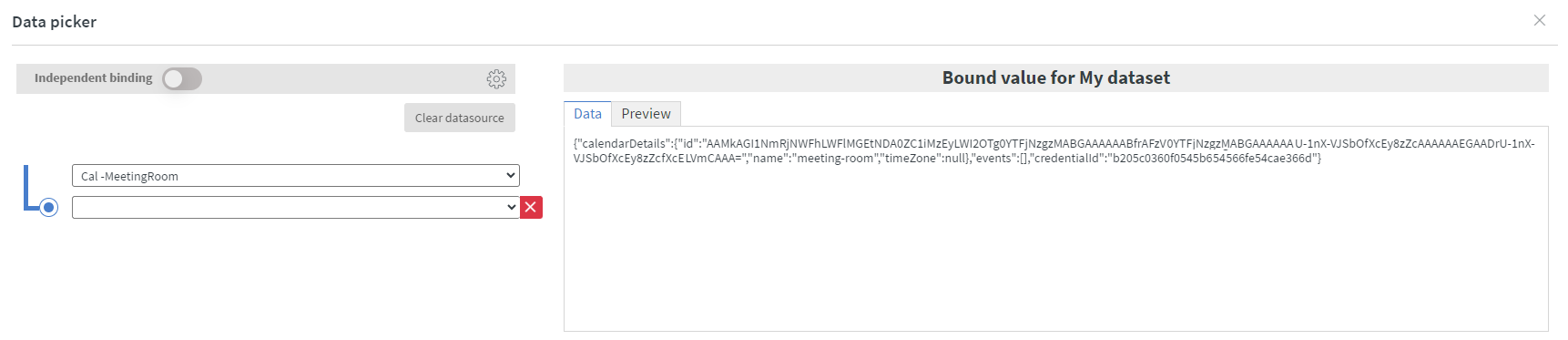
After you've successfully created your datasource you can place the Meeting Room app widget and configure the datasource binding.
- My dataset: This is the datasource you created that contains all you calendar events. Select only the root of the calendar. When configured correctly your datasource binding should
look like this:
Widget Settings
- General Settings
- Title Settings
- Time Settings
- Table Settings
In the General Settings section, you can configure various essential options for the widget's behavior and appearance.
- Refresh Interval: Set the refresh interval in seconds to define how often the application checks your calendar for updates.
- Widget Type: Choose from a range of widget types. For more details, see the Widget Types section.
- Global Font Settings:
- Select the font family.
- Adjust the font size to match your preferences.
- Text Visibility & Trimming:
- Set the maximum number of characters displayed in a string.
- Define how many characters should be trimmed from the beginning of a string for better display.
- Widget Layout: Choose the default structure of the widget—whether the title block appears above or below the time block (Title-Time or Time-Title).
In the Title Settings section, you can personalize the appearance of the widget's title blocks.
- Font Customization: Adjust the title's font style by making it bold, italic, or underlined, giving you full control over its emphasis.
- Color Selection: Customize the title color to either stand out for better visibility or blend seamlessly with the overall design.
- Font Size Adjustment: Modify the title’s font size relative to the global font size, allowing you to apply a magnification effect for enhanced readability or a more subtle look.
In the Time Settings section, you can customize the appearance and formatting of the widget's time blocks.
- Font Customization: Adjust the time's font style by making it bold, italic, or underlined, giving you full control over its emphasis.
- Color Selection: Customize the time color to ensure it stands out or blends seamlessly with the rest of the design.
- Font Size Adjustment: Modify the time’s font size relative to the global font size, allowing you to apply a magnification effect for better readability or a more subtle look.
- Time Language: Set the preferred language for time display, which is used when showing the day's name.
- Time Format: Choose between 12-hour or 24-hour format based on your preference.
- Date Format: Select from a variety of date formats to best match your region or style preferences.
In the Table Settings section, you can customize the appearance and structure of the table within the widget.
- Table Style: Adjust the overall style of the table to match your design preferences.
- Cell Border:
- Change the border color to customize the table’s appearance.
- Set the border width (in pixels)—if greater than 0, the table will be visible in widget types where it is recognizable.
- Cell Height: Define the cell height as a percentage, allowing for flexible layout adjustments.
- Card Customization:
- Modify the background color of the table's cards.
- Adjust the border radius for rounded or sharp corners.
- Set the padding to control spacing inside the cards.
Widget Types
- Actual meeting
- Next meeting
- Room state
- Room planner
- Week view
- Countdown
Actual meeting widget type can display the title and time of your current calendar event.
Check the documentation for Actual meeting mode
Next meeting widget type can display the title and time of your next calendar event.
Check the documentation for Next meeting mode
Room state widget type can display the status of your meeting represented as a colored bar or circle.
Check the documentation for Room state mode
Room planner widget type can visualize your timetable.
Check the documentation for Room planner mode
Week view widget type can display your weekly schedule in a table.
Check the documentation for Week view mode
Countdown widget type can display a countdown until the event you specify under Countdown settings starts.
Check the documentation for Countdown mode
Sensor events
Using sensor events you can change the led lights of your device depending on the status of your actual meeting type widget. Valid sensor events are:
- free
- busy
- starting
In this example the status light turns red on a QBIC device when there is an ongoing event:
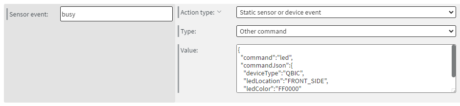
For more device-specific commands please refer to our article here.