Dropdown
What is the Form Dropdown?
With the dropdown form type you can select a single item from a dropdown list.
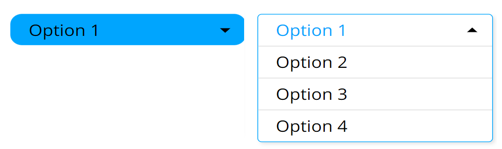
Options
Values
- Specifies the selections that will be rendered. Selections are separated by new lines, and each new line (enter press) is a new entry. Empty entries won't show up.
- Each entry can be tagged to be 'selected', 'correct', or both at the same time. The tags are cut off, and the rendered label won't contain them.
- Specifying tags:
[!]- Correct entry[*]- Selected entry[!*]or[*!]- Selected entry that is also correct
Examples:
[*]Largewill be rendered asLargeand will be selected.[!*]Smallwill be rendered asSmalland will be selected and marked as correct at the same time.
Color
- The primary/accent color of the dropdown.
- Default:
#00a5fe.
Font size multiplier
- A slider that multiplies the base font size (the General Font size, default
14px). - Range:
0.1to5, step0.1. - Default:
1.
Border radius
- The corner rounding of the dropdown, in pixels.
- Range:
0to60, step1. - Default:
16.
Setting Mock Field and Own Value
The Dropdown stores its value as the label of the selected option. It updates the Mock and Own values when:
- The dropdown is rendered.
- A selection is made.
- An external message tells it to change value.
Each write also stores the current values (the parsed option list), the color, and the
fontSizeMultiplier as properties.
Validation
The Dropdown evaluates the validity of the current selection (an option is valid when it was
tagged correct with [!]). The result drives the field's valid/invalid state, the Form
Summary, and the {FORM-NAME}-valid sensor event.
- Validity is evaluated on render and on an external Set Form or Reset Form.
- On a user selection, validity is re-evaluated only when "Validate" is enabled in the general settings.
There may be more than one correct option, or none at all. The validity follows the correctness of the currently selected option.
Sensor Events
The Dropdown sends two sensor events:
{FORM-NAME}-validvalue:[true/false]- emitted whenever validity is evaluated (render, external Set/Reset Form, and user selection when "Validate" is enabled).{FORM-NAME}is the name given to the dropdown.{FORM-NAME}value:[selected label]- emitted whenever the value is written (render, selection, and Set/Clear/Reset Form unless the command is silent).
When the localisation language changes and a label is (re)translated, the dropdown also
re-emits the {FORM-NAME} event carrying the new translated label.
External Messages
The dropdown listens to all three basic external messages:
- Set Form: Reads the
valueparameter and splits it into options by semicolons (;), applying the same[!]/[*]/[!*]tagging rules as the Values option. The options replace the current list, and the Mock and Own values are updated. If the value produces no options, the message is ignored and nothing is updated. - Clear Form: Keeps the current options but clears the selection, selecting the first option instead, and updates the Mock and Own values accordingly.
- Reset Form: Rebuilds the options from the editor Values (plus any bound datasource values), updates the Mock and Own values, and re-evaluates validity.
The silent variants of Clear and Reset do the same but suppress the {FORM-NAME} sensor event.
Value from Datasource
If a bound (external) datasource array is assigned to the dropdown, its elements are converted to options the same way as the Values option and appended after the editor values.
- String elements are used directly as labels.
- Object elements use the value at the configured datasource search key as the label.
- A plain object datasource contributes its keys as labels.
- When "Remove duplicates" is enabled in the general settings, repeated values are dropped.
On render, if the bound form output datasource already holds a value for this field, the matching option is pre-selected.