Radio
What is the Form Radio Button?
With the radio button form type, you can select a single item from a list of options. In the settings, you define the available items and control how the buttons look, including an image mode where every option shows a picture.
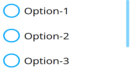
Options
Values
- Specifies the selections that will be rendered. Selections are separated by new lines, and each new line (enter press) is a new entry. Empty lines are skipped.
- Each entry can be tagged to be 'selected', 'correct', or both at the same time. The tags are cut off, and the rendered label will not contain them.
- The tag, if present, must be at the start of the line:
[!]- Correct entry[*]- Selected entry[!*]or[*!]- Selected entry that is also correct
Examples:
[*]Largewill be rendered asLargeand will be selected.[!*]Smallwill be rendered asSmalland will be selected and marked as correct at the same time.
Button Style
Specifies how the radio buttons look. Default: Rounded
None
- No box appears; the label itself is the radio button.

Rectangular
- Rectangular styled boxes appear.

Rounded
- Rounded styled boxes appear.

Color
- No label is shown; each value line is treated as a color code, and the box's circle is filled with that color.


Image
- Every option is rendered as a picture with its label underneath (or beside, depending on the image placement). This is the mode where the radio button pulls its images out of the value text.
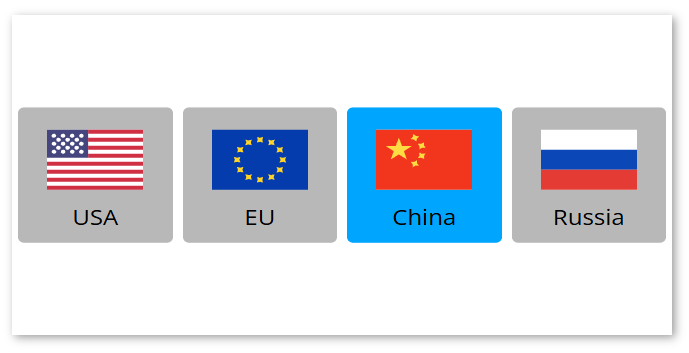
How the images are extracted
When Button Style is set to Image, the widget reads the image for each option from the folder configured in the Image folder general setting (Select Option Image Folder). The image file is referenced from inside the value line using a [fileName] token written in square brackets:
- The image file name (including its extension) is written in square brackets anywhere after the label text.
- The
[fileName]token is removed from the rendered label, and its contents are matched against the file names in the selected image folder. The matched image is then displayed for that option. - The value tags (
[*],[!],[*!]) are parsed first and stripped, so a single line can carry both a value tag and an image token.
Example value lines (with an image folder that contains pizza.png and burger.png):
[*]Pizza[pizza.png]
Burger[burger.png]
Pizzais shown withpizza.pngand is selected by default.Burgeris shown withburger.png.
The image is looked up by exact file name in the configured Image folder. If no file matches, the option is shown without an image.
Image styling options
These options are only visible when Button Style is set to Image.
- Image placement: Where the image sits relative to the label. Possible values:
Left(image left of text),Right(image right of text),Top(image above text),Bottom(image below text). - Distance between image and text: Spacing between the image and its label. Range: 0 - 50. Default: 0
- Image rounding: Rounds the corners of the image, in percent. Range: 0 - 50. Default: 0
- Image size: The image size, in em. Range: 0.5 - 10. Default: 3
- Image border width: Border thickness of the image, in pixels. Range: 0 - 30. Default: 0
- Image unselected border color: Border color of unselected images. Default:
#000 - Image selected border color: Border color of the selected image. Default:
#000 - Selected Background Color: Background color behind the selected image. Default:
#00a5fe - Image button text box height: Height of the label text box under/next to the image, in pixels. Range: 0 - 150. Default: 30
Width Mode
- Specifies the generated boxes' width mode.
- Possible values:
- Default: Each box only takes up the space it needs.
- Auto: Every box takes up the same space.
- Fixed: Every box takes up at least the specified fixed width.
- Fixed width (px): The minimum width per box, in pixels. Only visible when Width Mode is
Fixed. Default: 100
Additional Settings
- Primary Color: The primary color used by the boxes, affecting both the box and the selected background color. Default:
#00a5fe - Unselected Background Color: The unselected buttons' background color.
- Unselected Font Color: The unselected buttons' font color.
- Background Rounding: The rounding of the buttons' backgrounds. Default: 12
- Distance between buttons: Spacing between the buttons. Default: 5
- Line height: The line height applied to the option list. Default: 1
- Direction: The flex direction used by the widget. Possible values:
- Column
- Row
- Column-Reverse
- Row-Reverse
Setting Mock Field and Own Value
The radio button sets its own value and the mock value simultaneously. The value is the label of the selected option (translated, if a localisation is active). This occurs when:
- The radio button is rendered. If a selected option is defined, the Mock and Own values are set to it.
- Every selection is made.
- An external message tells it to change values or selections.
In the editor (not the displayer) the value is not written out; writing only happens on a live displayer.
Validation
- If validation is enabled (the Validate Field general setting), the form evaluates the selection.
- The field is valid when the selected option is marked as correct (
[!]), and invalid when an option that is not correct is selected. - If Show Validation is enabled in the Error settings, the field's validity is indicated by a colored border.
Sensor Events
-
On every value write, the field emits a sensor event named after the form, carrying the selected label:
{FORM-NAME} value: [selected label] -
When validation runs, the field emits a validity event:
{FORM-NAME}-valid value: [true/false]{FORM-NAME}is the name assigned to the radio button.- The value is
trueorfalsedepending on the validation result.
-
When the active language changes (via the
setLocalisationexternal command), the{FORM-NAME}event is re-emitted with the translated label of the current selection.
Example:
example-radio-button -> Large
example-radio-button-valid -> true
External Messages
The radio button listens to the three basic external messages:
- Set Form: Takes the value from the message and splits it by the
;(semicolon) character into options, parsing the same value tags ([*],[!],[*!]) as the Values setting. It replaces the current options and updates both the Mock and Own values. If the message value is empty, the options are cleared. - Clear Form: Removes the current selection and clears both the Mock and Own values.
- Reset Form: Restores the radio button to its initial state (re-reads the Values setting). Validation is re-evaluated.
Value from Datasource
- If a datasource array is assigned to the radio button (via value from datasource), its elements are converted into selectable options the same way as the Values setting and appended after the static values.
- String array elements are used directly.
- For an array of objects, the value of the key set in the Datasource search key general setting is used from each object.
- For a plain object, its keys are used.
- The Remove duplicates general setting filters out duplicate options.
- When the datasource value changes on a live displayer, the radio button resets its options to reflect the new data.