Date
What is the Form Date?
The Date or Date picker is used, as the name suggests, as a date-picking field, which can be styled to your preference.

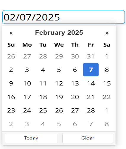
Options
- Position
- Language
- Date format
- Title
- Set today as default
- Highlight today's date
- Show today button
- Show clear button
- Border radius
- Color
Specifies where the date-picking pop-up appears relative to the input field. The pop-up is always left-aligned to the field. Values: Bottom (default), Top.
Specifies the language of the calendar (day names, month names, and the Today/Clear button labels). Values: English (default), Hungarian, French, German, Spanish, Russian, Polish, Swedish.
Specifies the format used to display and parse the selected date. Default: Month/Day/Year (mm/dd/yyyy).
Available formats:
- Year/Month/Day (
yyyy/mm/dd) - Year/Day/Month (
yyyy/dd/mm) - Month/Day/Year (
mm/dd/yyyy) - Day/Month/Year (
dd/mm/yyyy) - Year.Month.Day (
yyyy.mm.dd) - Year.Day.Month (
yyyy.dd.mm) - Month.Day.Year (
mm.dd.yyyy) - Day.Month.Year (
dd.mm.yyyy) - Year-Month-Day (
yyyy-mm-dd) - Year-Day-Month (
yyyy-dd-mm) - Month-Year-Day (
mm-yyyy-dd) - Day-Month-Year (
dd-mm-yyyy)
Specifies the title text shown at the top of the date-picking pop-up. Default: empty (no title).
When enabled, today's date is preselected on render if no stored value is loaded from the datasource. Default: enabled.
Specifies whether today's date is highlighted in the calendar. Default: enabled.
Specifies whether the Today button appears inside the pop-up. Default: enabled.
Specifies whether the Clear button appears inside the pop-up. Default: enabled.
Specifies the corner rounding of the input field, in pixels. Range: 0-60 (step 1). Default: 16.
Specifies the accent color used for the active field border and the calendar highlight. Default: #00a5fe.
Setting Mock Field and Own Value
The Date picker exports its own value (the selected date string) and the mock field only while running in the displayer; in the editor the export is skipped. This happens:
- When the Date picker is rendered (the initial value from the datasource, or today's date when Set today as default is enabled).
- When the input field loses focus (blur), for example after a date is selected and the pop-up closes.
- When an external message tells it to.
Validation
The Date picker doesn't validate itself.
Sensor Events
The Date picker doesn't validate, so it never emits a {FORM-NAME}-valid sensor event. Whenever the value is exported it triggers a value sensor event named after the field ({FORM-NAME}) carrying the selected date, unless the export was requested silently (by a Reset or Clear command).
External Messages
The Date picker listens to all the basic messages.
- Set Form: Takes the message's
valueparameter (which must be a string), sets it as the selected date, saves it to the mock, and updates the own value. Note: the value should match the configured date format. If it does not, setting the date can produce an undesired outcome.- Clear / Reset Form: Both clear the selection to empty and update the mock and own value. When the framework requests the update silently, no value sensor event is fired.
Value from Datasource
The Date picker does not bind an external input datasource to generate its content. When the widget is connected to a form output datasource that already holds a value for this field, that value is loaded as the initially selected date on render. If no stored value exists and Set today as default is enabled, today's date is selected instead.