Contents menu
The Contents page lists your Contents, Slides and Playlists, organized in folders. The controls at the top of the page let you filter, search and switch between views.
Content type buttons
The buttons next to the Contents title show one type at a time, or all of them:
- All
- Slides
- Playlists
- Contents

Your choice is saved for your user, so the list opens with the same type on your next visit. On a narrow window, the same choice is shown as icons or a dropdown.
A Schedules (legacy) button also appears on accounts that still have Schedules created with the old Schedule content type.
If the list looks empty, check that All is selected first. Learn more: A user sees no content
Creating new items
Click the red + button next to the Contents title to create new items or add a folder.
Learn more:
Search
- Search type — the dropdown at the start of the search bar sets what the search matches: All, Name, ID or Tag. Depending on your role, some options may not be available.
- Search bar — type to search.
- Assigned to device selector — the icon at the end of the search bar narrows the list to All, Assigned or Unassigned items, depending on whether they are assigned to a Device.
Page controls
| Icon | Name | What it does |
|---|---|---|
| Find folder | Opens a folder picker, so you can jump straight to a folder. | |
| Filter | Opens the Quick filters panel, where you can apply a saved quick filter or add a new one. Click it again to close the panel. While the panel is open, the content type buttons are hidden. | |
| Refresh | Reloads the list. | |
| Download contents in spreadsheet | Downloads your contents as a CSV spreadsheet. | |
| Help | Opens the help options, such as Visit knowledge base, Video tutorial, Open ticket and Hotkeys. The options shown depend on your account. | |
| AI assistant | Opens or closes the chat panel, where you can ask questions about the platform. Shown when your role has access to AI features. |
Learn more:
Views
The last icon in the top row is the View selector. Your choice is saved for your user.
Card view
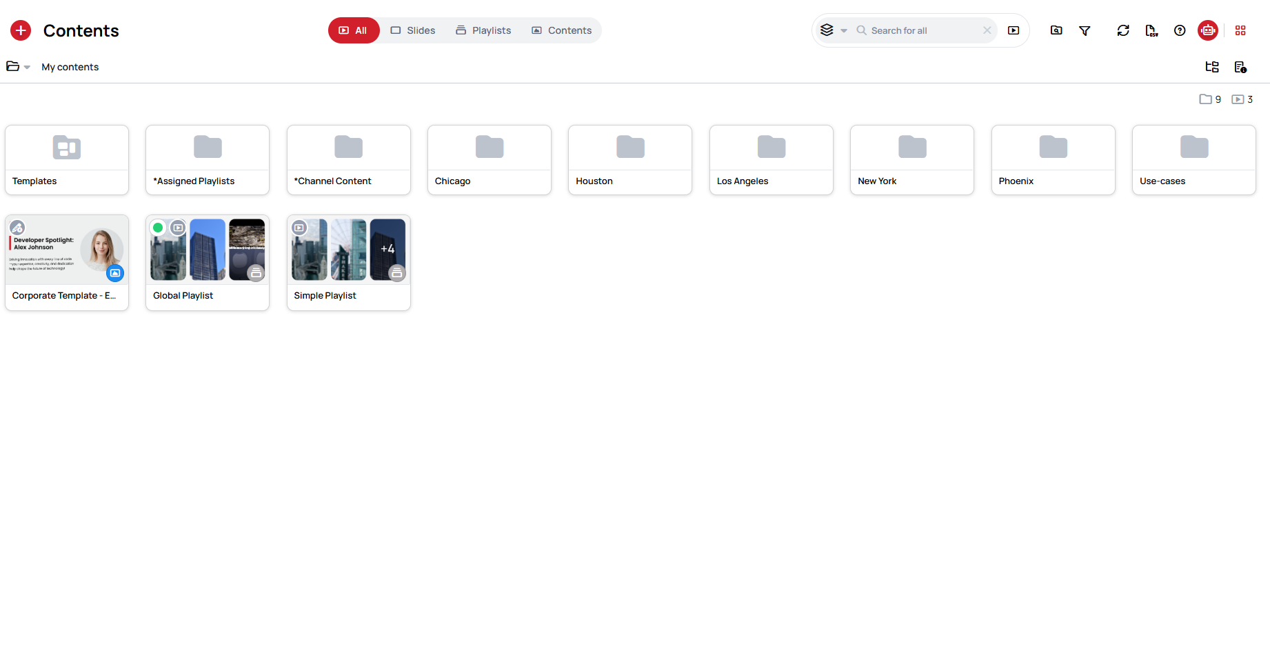
Folders and items are shown as tiles with a preview image, as in the first screenshot on this page.
List view
Each folder and item gets a row of its own, with more details and the most used actions next to it.
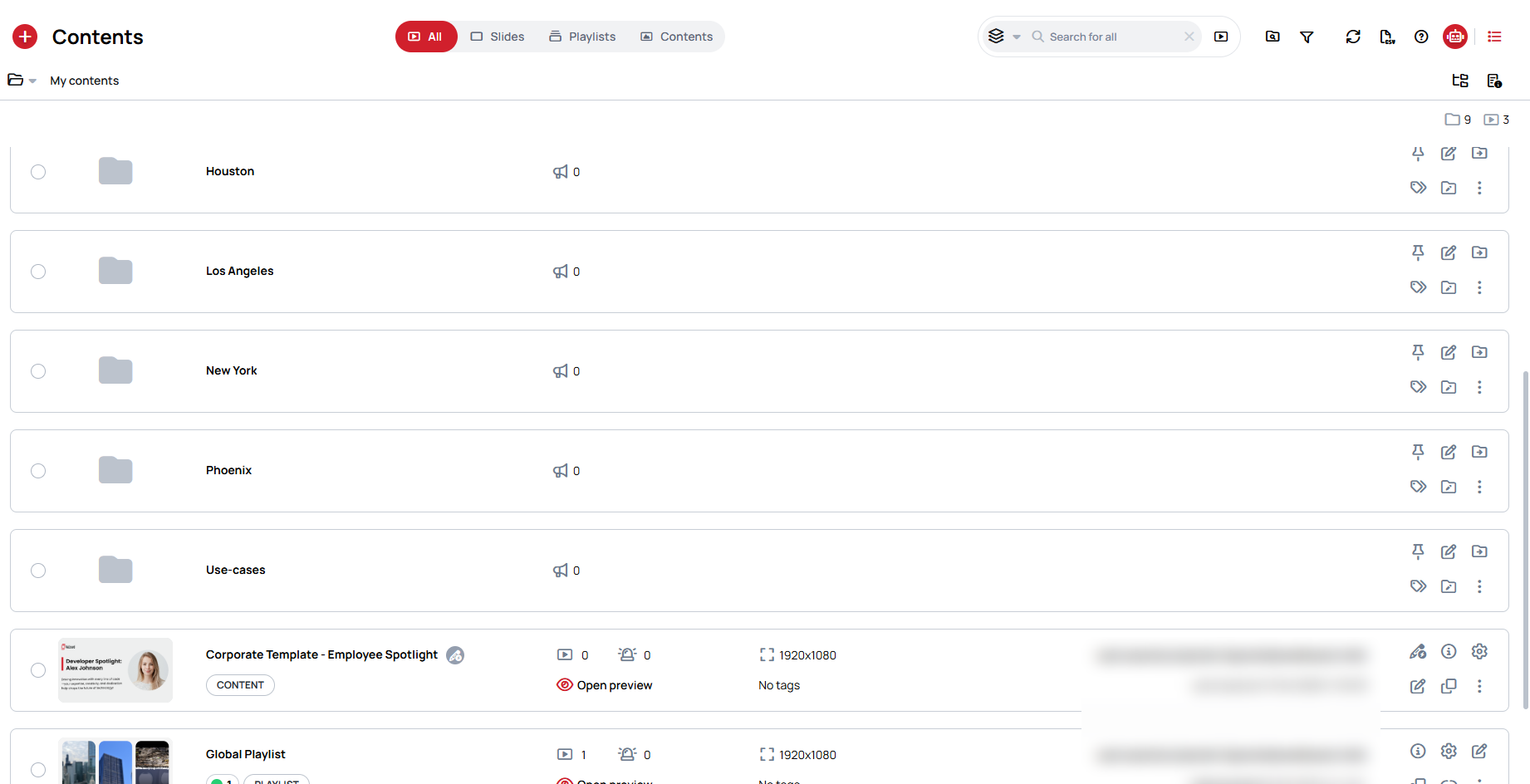
Table view
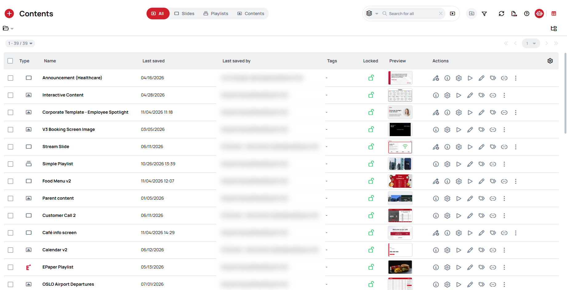
All items are listed in a table with sortable columns, pagination and actions in each row. Use the icon at the end of the header row to choose which columns are shown. Your column setup, sorting and column widths are saved, and can be reset to the default.
Folders
- Folder selector — the folder icon below the Contents title opens a dropdown with your Recent folders. Next to it, the path of the current folder lets you step back to any parent folder.
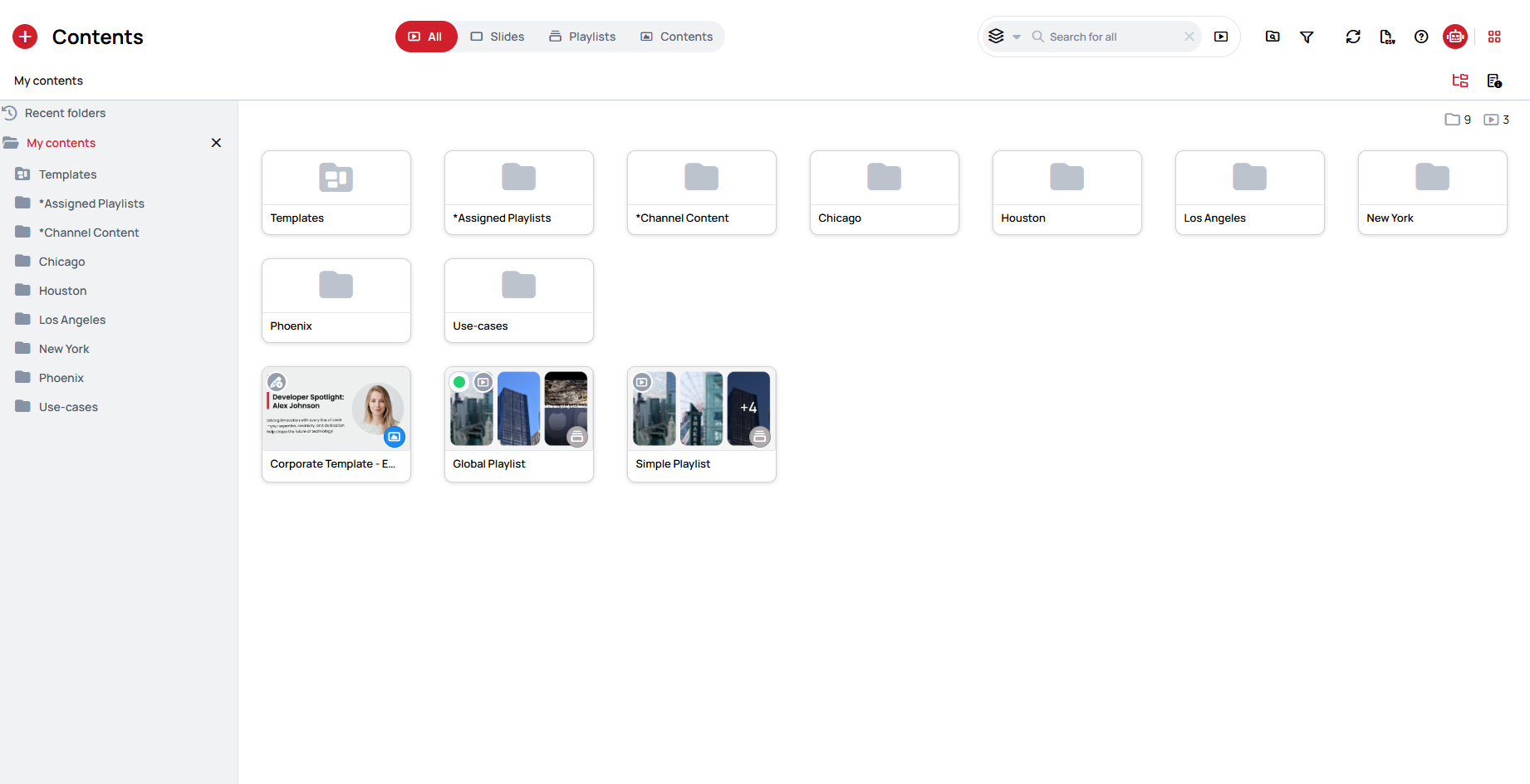
- Folder tree — the icon on the right shows or hides the folder tree, a panel listing Recent folders and every folder under My contents.
- Details — the icon shows or hides the Details panel.
- Counters — the numbers in the top right corner show how many folders and how many items are in the current folder.
Item details
Click the Overview icon on an item to open its details page, with its usage, settings, Proof of Play, analyzer and logs in one place.
Learn more: Content details