Text Widget
The Text widget allows you to add text-based information into your content.
The best way to learn the Text Widget is through a built example. These guides use it:
- How to change text with carousel widget
- How to collect data into an internal datasource via Datasource Actions
- How to Create a Dynamic Menu using Excel
- How to make a Bird database
- How to manipulate channel playlist via Touch actions
- Simple birthday datasource
Properties
Text
In the Text Box, you can type the text that you want to display on the canvas.

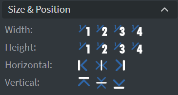
Size & Position
In the Size & Position Menu, you can select the width, height, and placement of your widget quickly.
Font
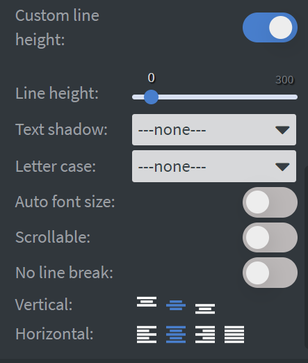
In the Font Menu, you can set the size, family, style, and color of the font.
- You can also set Letter spacing and Shadow here.
- Enabling Dynamic font size will calculate the font size according to the text box size.
- Enabling Scrollable will allow you to scroll through your text in interactive contents.
- You can also change the Vertical and Horizontal alignment of the text.
- No Line Break is useful for data binding by allowing your text to remain on one line and not wrap.
- The color of the font can also be overridden in the Quick Editor when Quick editing is enabled on the widget.
- Learn more: Quick Editable Widgets
Proof of Play
Learn more: Enable reporting (Content) and Enable reporting (Slide).
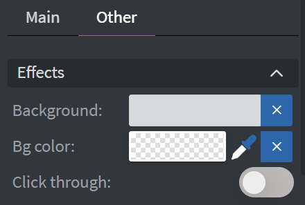
Effects
In the Effects Menu, you can select a Background image or Color for your widget. Enabling the Click through function allows you to click through the widget and interact with other widgets behind this one.
Animation
In the Animation Menu, you can choose the Enter, Repeat, and Exit animations of your widget.

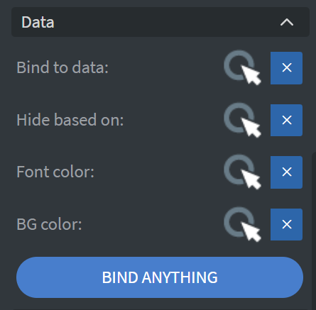
Bind to Data
You can use the Bind to data tool to select your Datasource.
- With Hide based on, you can hide the widget based on data from a Datasource.
- With BG color, you can give a background color for the widget from a Datasource.
- The Font color data binder allows you to give a color for the text in the widget from a Datasource.
- If the data row of the device and the given data are not the same, the widget will not appear on the device.
Translation
In the Translation Menu, if the language of the content is altered (e.g., through a sensor or touch event), the value of the widget may also change.

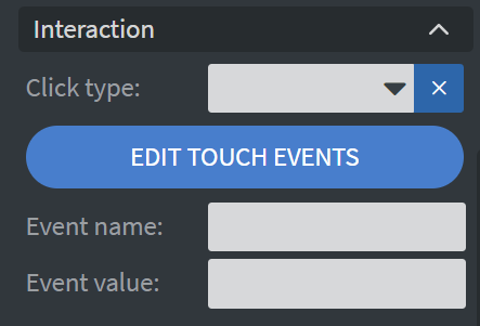
Interaction
In the Interaction Menu, you can choose a Click type interaction and Touch sound for your widget.
Additional Properties
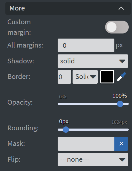
Under the Interaction Menu, you can click on the three dots to access Additional Properties (aka MORE).
Additional Options
The following options are available:
- Shadow: Adds a shadow to your widget.
- Border: Adds a border to your widget.
- Rounding: Changes the transparency and rounds the edges of your widget.
- Opacity: Adjusts the transparency of your widget.
- Mask: Lets you select a PNG image to affect the shape of your widget.
- Flip: Allows you to flip your widget horizontally, vertically, or both.