Video Widget
With the Video widget, you can add a single video to your content.
Properties
Source
In the Source Menu, you can select the video that you want to display and set the volume level.

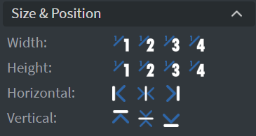
Size & Position
In the Size & Position Menu, you can select the width, height, and placement of your widget quickly.
Effects
In the Effects Menu, you can set the Rounding and Opacity of your widget.

Proof of Play
Learn more: Enable reporting (Content) and Enable reporting (Slide).
Behaviour
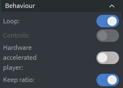
In the Behaviour Menu, you can utilize settings to choose how you would like to render your video:
- Loop: Continuously loop a video. This option will be disabled if the element is set to jump to the end page, has an exit animation, or has enabled controls.
- Controls: Disable or enable video controls. This option will be unavailable if the element has the loop option enabled.
- Hardware Accelerated Player: For improved performance, use the screen's Hardware Accelerated Player instead of the HTML player.
- Keep ratio: Maintain the aspect ratio of the video source.
Additional Effects
In the additional Effects Menu, you can set Shadow and Border here.

Animation
In the Animation Menu, you can choose the Enter and Exit animations of your widget.

Bind to Data
You can use the Data Picker tool to select your Datasource.

Additional Properties
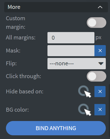
Under the Proof of Play Menu, you can click on the three dots to access Additional Properties (aka MORE).
Additional Options
The following options are available:
- Custom Margin: Allows you to set a custom-sized margin to your widget.
- Mask: Lets you select a PNG image to affect the shape of your widget.
- Flip: Allows you to flip your widget horizontally, vertically, or both.
- Click Through: Enables clicking through the widget to interact with other widgets behind it.
- Hide Based On: Hides the widget based on data from a Datasource. If the datarow of the device and the given data are not the same, the widget will not appear on the device.
- Background Color (BG Color): Sets a background color for the widget from a Datasource.