Device Metrics
Device Metrics shows a device's uptime, performance measurements, and events over a selected time range. Use it to investigate changes in device behavior or compare two devices.
Open a device's metrics
Go to Analytics → Device Metrics and search for a device in the selector. You can also select a device under Devices and open its Metrics tab.
Choose a time range above the charts. Presets include Last 24 hours, Last 7 days, and Last 30 days; you can also choose a custom range of at least 15 minutes. The Analytics page remembers your selected range and uses the last 30 days by default. Use the refresh control to request the latest available measurements.
Understand the data
The page groups measurements by type. Charts appear for groups with data in the chosen range; groups without data remain unavailable.
| Group | What it shows |
|---|---|
| Uptime | Online periods, the hours the device was scheduled to run, reconnections, and, when available, configured reboots. |
| CPU | Usage, temperature, process count, and thread count. |
| GPU | Frames per second, including a one-minute average when reported. |
| Memory | System, virtual, and application memory use. |
| Storage | Storage used by the application cache and downloaded file counts. |
| Network | Data received and sent (RX/TX), request counts, and server response measurements. |
| System | Wi-Fi signal strength and level, internet connection, and battery measurements. |
| Logs | Counts of info, warning, and error messages. |
| Application events | Starts, crashes, and system errors. |
| Sensor and user events | Sensor triggers and user interactions. |
Other metric charts show measurements over time. Hover over a chart to inspect values at a point rather than relying only on the overall trend.
Read the Uptime chart
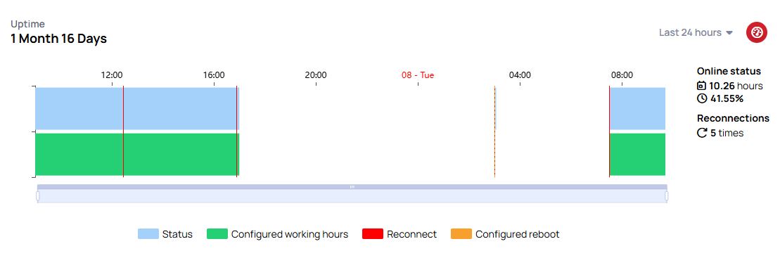
The Uptime chart puts two different things side by side: when the device was online, and when it was supposed to be running.
| In the chart | What it is |
|---|---|
| A blue band, Status | The periods the device was actually connected |
| A green band | The hours the device was scheduled to run, taken from its Working Hours |
| A red line, Reconnect | Each time the device reconnected |
| An orange dashed line, Configured reboot | The device's reboot time, marked across the range |
Laying the blue band against the green one tells you whether the screen is meeting its schedule, and a cluster of red lines is the classic fingerprint of a weak network — a device dropping and rejoining, which is what leaves content half-updated.
The band is a setting, not evidence. It shows the hours the device was meant to be running — not that a screen was powered on, and not that content played. Online status is the separate, recorded measure.
Working hours that changed
When a device's Working Hours are edited, the previous configuration is kept with the period it applied to, so a report covering a change shows the earlier hours against the earlier days rather than applying today's schedule to all of them. Changing a schedule now does not rewrite how past days are drawn.
The chart label tells you which one you are looking at:
- Working hours — the device has earlier saved schedules, and the bands reflect them
- Configured working hours — there is no saved history, so every day is drawn against the current setting
Nothing was recorded before this feature arrived, and it is not filled in retrospectively. A range reaching further back is drawn with the current setting, which is a fallback rather than evidence of what was configured then. Saved entries are also removed in line with the device-metrics retention period, so this is not a permanent audit trail.
The chart says so when a time zone is missing, and its working-hours and reboot markings may be out of step with reality until you set one.
Two things the chart does not claim
- Online status is a share of the whole selected period, not a Working Hours score. A device online for 8 hours of a 24-hour period reads 33%, even when those 8 hours covered its entire schedule.
- Configured reboot markers use the current reboot time, repeated across the dates you selected. They are not a history of reboot settings, and they do not show that a reboot happened.
Learn more: Working hours — setting the schedule the green band is drawn from
The same chart appears on a device's Overview tab, where it sits beside the device's lifetime uptime figure. Learn more: Uptime chart
The available groups and measurements depend on the device and the data it reports. An empty group does not by itself mean the device is offline.
Compare and focus the view
Select the compare control beside the device selector, then choose a second device. The charts label each device's data; use the X control beside the second selector to end the comparison.
Use a group's Hide control to remove it from the view. Hidden groups remain available above the charts, where you can show one again or use Show all. You can also focus on one group and enlarge an individual chart with its maximize control. Close the enlarged view to return to the charts.
Investigate a device issue
For a routine check, start with Uptime and the warning and error counts. Then look for sustained CPU or memory pressure, storage filling up, and network interruptions. A single spike may be less useful than a recurring pattern.
If playback or interaction seems slow, compare CPU, memory, storage, and network charts over the same time range. Check whether high usage or slow server responses line up with a connection gap, application crash, or error in the logs. Use a longer range, such as the last 30 days, to see whether a problem repeats before deciding on maintenance or a device upgrade. The chart does not apply a universal CPU threshold to every device model.
If measurements are missing
First check the selected device and time range, then refresh the measurements. If the device has just started reporting, allow time for its first measurements to arrive; refreshing the page does not make it send data immediately. A metric may also be unavailable for that device type or have no samples in the selected period.
When data was present earlier, check Uptime for connection gaps and compare another range. If the device was online but several measurements stopped together, investigate the device's connection and application events. Device status can update separately from historical metric samples, so an online indicator alone does not guarantee that every chart has data.