Quick Editor Field Layout
A Content or Slide with many quick-editable Widgets gives its contributors a long list of fields to scan. With a field layout you sort those fields into named groups and put them in the order they are filled in, so the Quick Editor shows a short, sectioned form instead.
You set the layout up once on the Content or Slide. The same groups then appear wherever that Content or Slide is quick edited, including inside a Playlist.
Learn more: Quick Editable Widgets
Open the layout manager
- Open the Content or Slide from Contents.
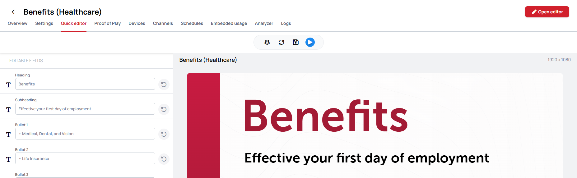
- Select the Quick editor tab.
- In the toolbar above the preview, click the first icon, , labeled Manage layout on hover.
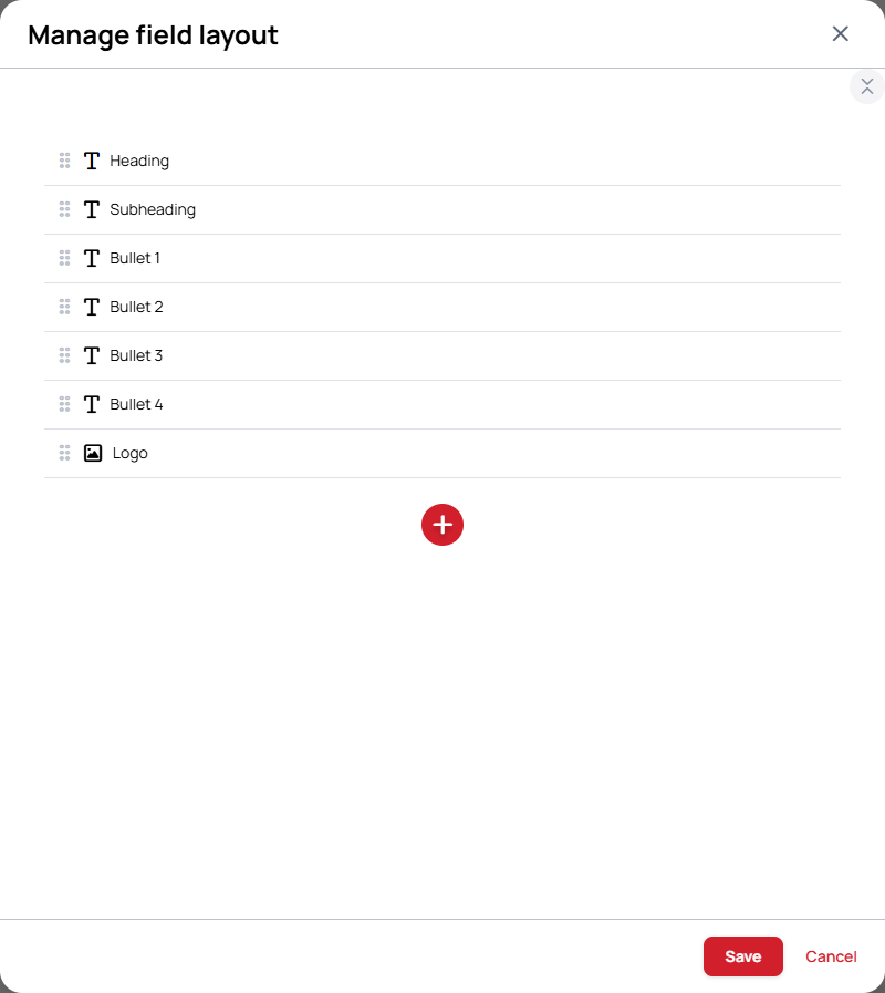
The Manage field layout window opens, listing the quick-editable fields of the Content by their layer name.
The Quick editor tab only appears for a quick-editable Content or Slide, and only for users who are allowed to edit it.
Plan your groups
Before you start dragging, look at the screen the way a contributor will. A good group is a set of fields that are always changed together, and its name says what that part of the screen is.
Example: a benefits Slide
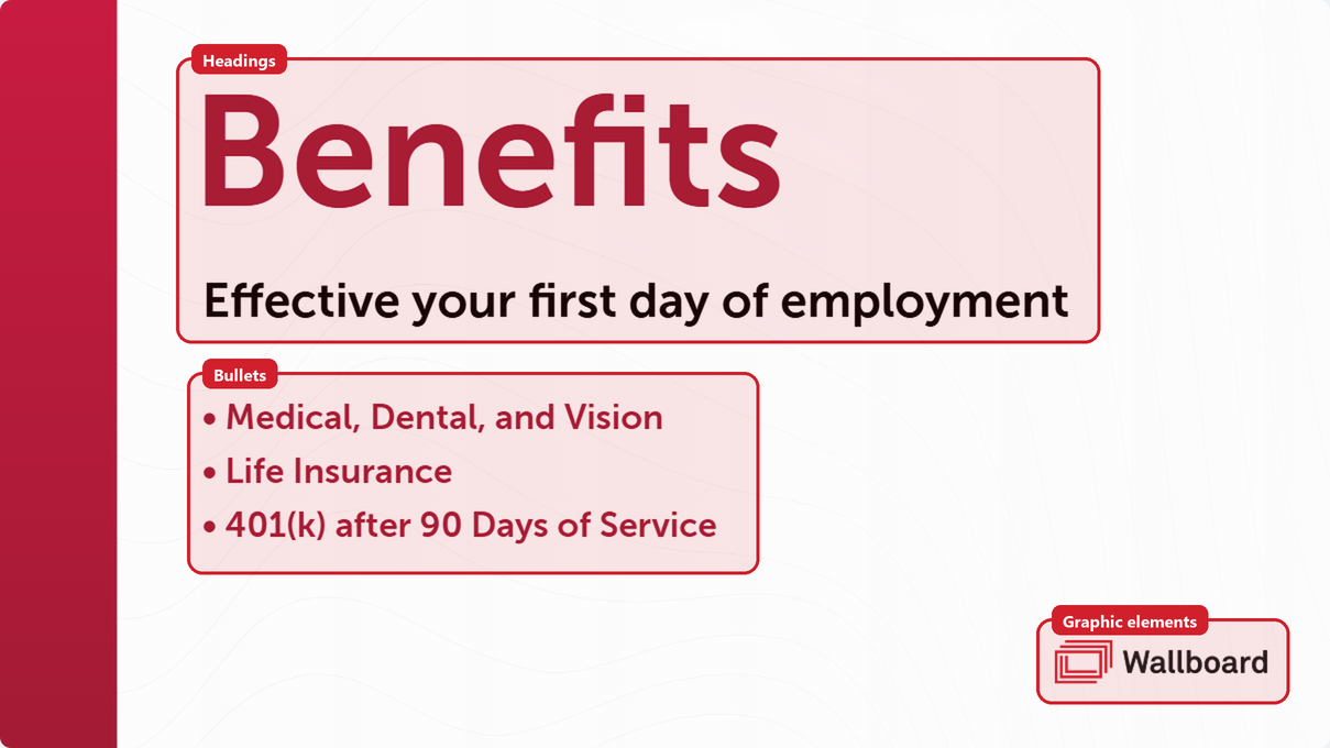
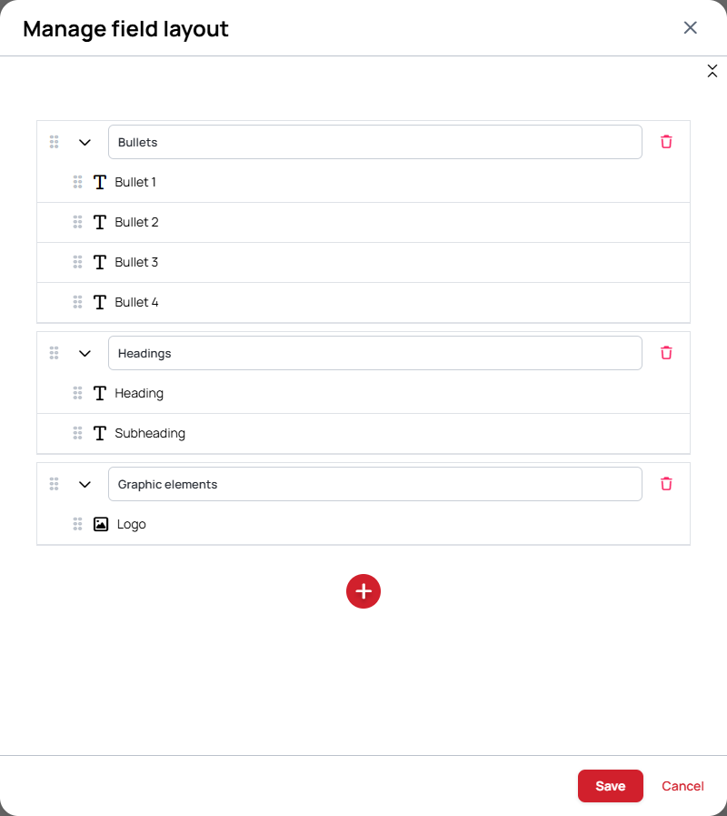
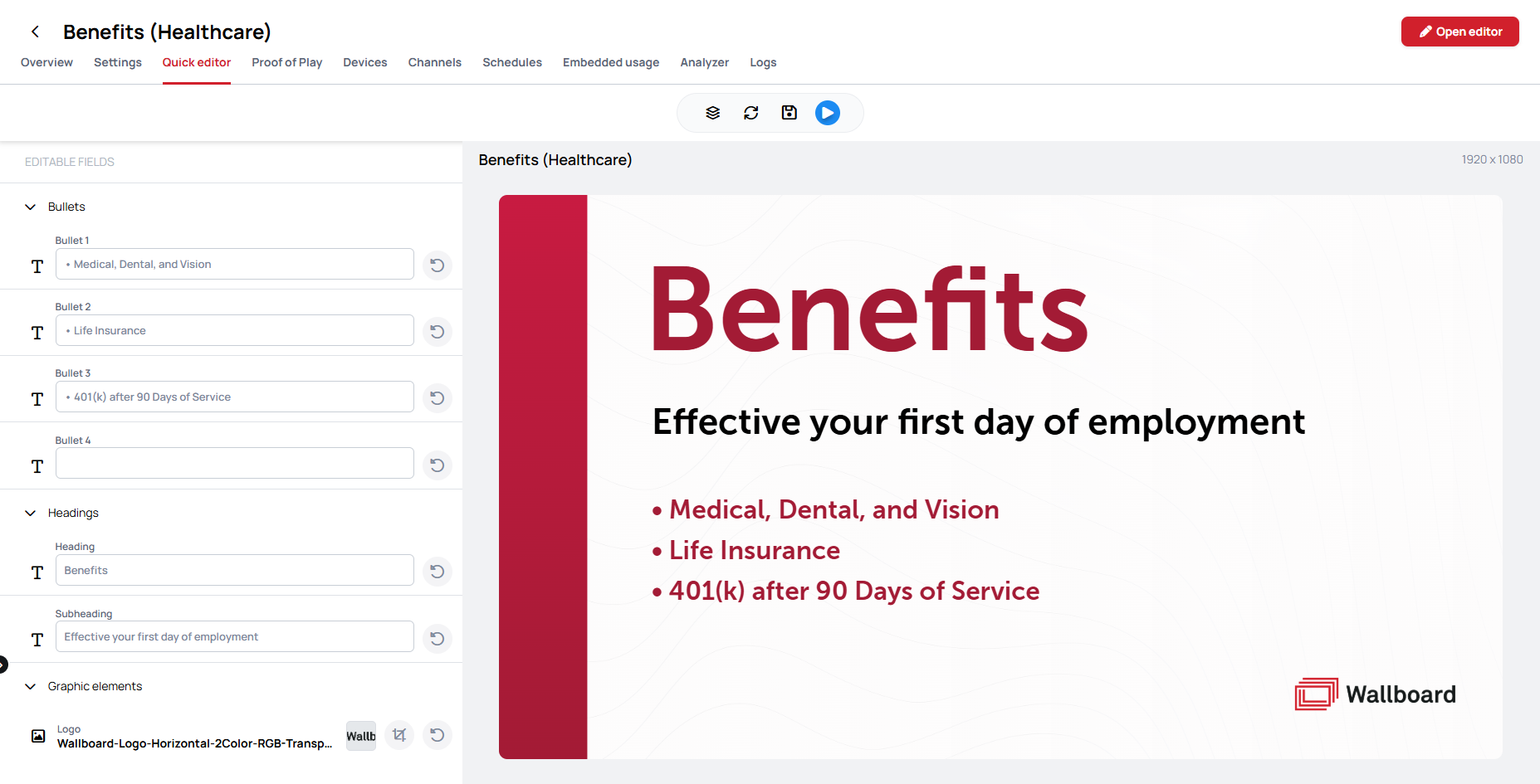
This Slide has seven quick-editable fields: Heading, Subheading, Bullet 1 to Bullet 4, and Logo. Without a layout, a contributor gets them as one flat list. Looking at the screen, they fall into three parts:
| Group | Fields inside | Why |
|---|---|---|
| Bullets | Bullet 1, Bullet 2, Bullet 3, Bullet 4 | The benefits themselves. They change most often, so this group goes first. Bullet 4 is empty on screen, but keeping it in the group means a contributor adding a fourth benefit finds the field right where the others are. |
| Headings | Heading, Subheading | The title of the Slide. Both change together when the Slide is reused for another topic. |
| Graphic elements | Logo | Rarely changed, so it goes last, out of the way. |
The rest of this article builds this layout step by step.
Example: a wayfinding screen
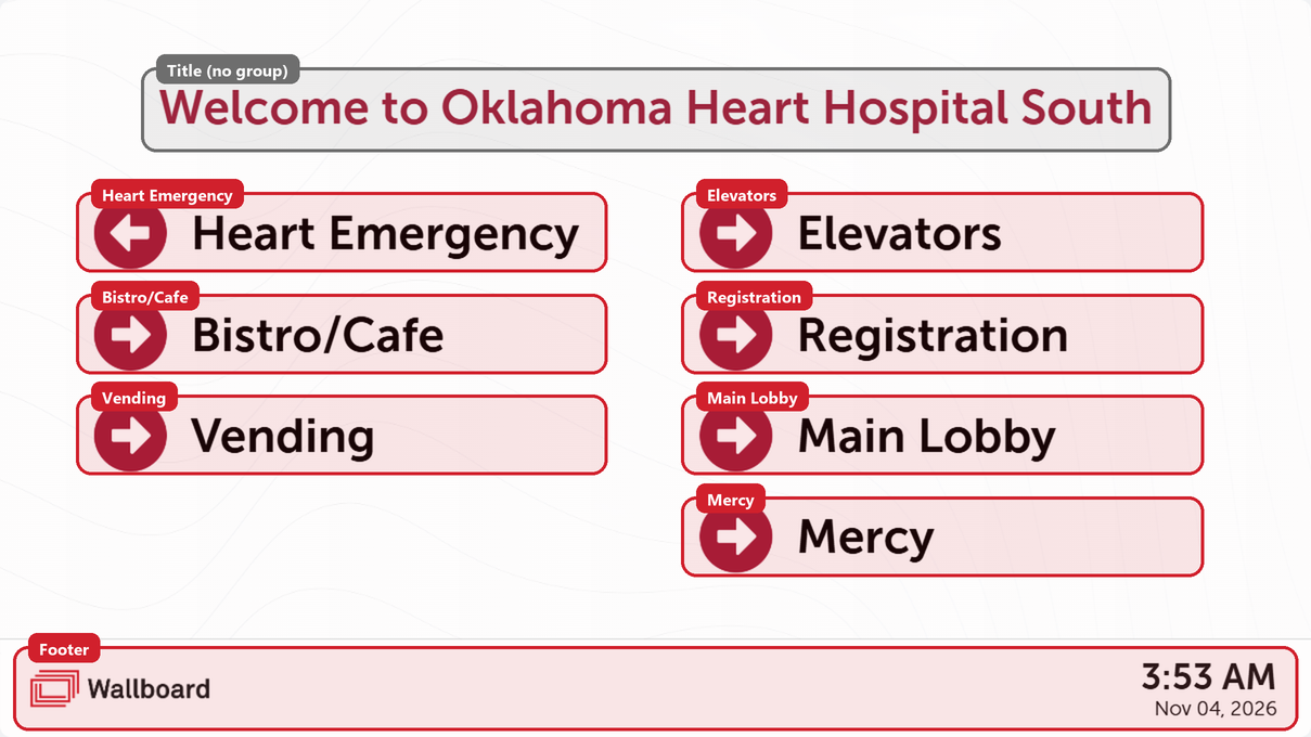
Here, every destination is an arrow image and a location name. Changing a destination means changing both, so each pair becomes one group, named after the destination:
| Group | Fields inside |
|---|---|
| Heart Emergency | Wayfinding Arrow 1, Location 1 |
| Bistro/Cafe | Wayfinding Arrow 2, Location 2 |
| … one group per destination | |
| Footer | The fields at the bottom of the screen |
The welcome title is a single field, so it stays on its own, outside any group.
Tips
- Name a group after what is on the screen, such as Bullets, Heart Emergency or Footer, not after the Widget type.
- Group fields that change together, like an arrow and its destination, or a heading and its subheading.
- Leave a field on its own when it stands alone. A single title does not need a group around it.
- Put what changes most often first. Otherwise, follow the screen from top to bottom.
Arrange the fields
- Add a group: click the round Add group button below the list. The new group appears at the bottom of the list; type a name for it.
- Move fields and groups: drag a row by its handle. Drop a field onto a group to put it inside, or between rows to change the order.
- Rename a group: type over its name.
- Remove a group: click its Remove button. The fields inside it are not deleted; they move back to the top level, in the place the group used to be.
- Expand or collapse: open and close a group with its arrow to make dragging easier. The button at the top right of the list collapses every group at once, or expands them again; its label switches between Collapse all and Expand all.
If the Content has more than one page, select the page at the top of the window. Each page has its own layout.
When you are done, click Save. The Quick Editor reloads its preview with the new layout. Values you had typed into the fields but not yet saved are kept.
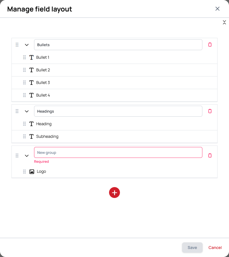
Every group needs a name. Save stays disabled while a group has no name.
How the layout behaves
- Groups are one level deep. A group holds fields, never another group.
- The base datasource stays on top. If the Content has a quick-editable base datasource, it is always shown above the groups and cannot be put into one.
- Expanded or collapsed is not saved. Every group opens in its default state the next time the Quick Editor is opened.
- The layout is part of the Content. It is saved with the Content or Slide, and every Playlist page that uses it shows the same groups.
- The layout travels with the Content. Duplicating, exporting or importing a Content or Slide keeps its groups, so a template you share already comes with its fields sorted.
In the Playlist Quick Editor
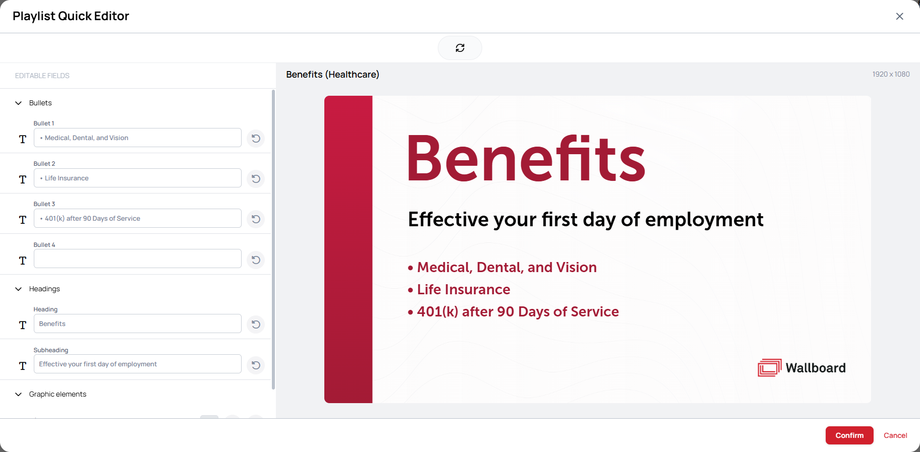
When the Content or Slide is quick edited from a Playlist, its fields appear in the saved groups, which can be expanded and collapsed. The layout itself can only be changed from the Content or Slide's own Quick editor tab, not from the Playlist.
Learn more: Quick Editor in Playlists