Pieces Widget
Properties
Image
In the Image Source Menu, you can select the image that you want to display in your content.

Size & Position
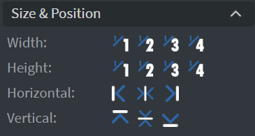
In the Size & Position Menu, you can select the width, height, and placement of your widget quickly.
Proof of Play
Learn more: Enable reporting (Content) and Enable reporting (Slide).
Behaviour
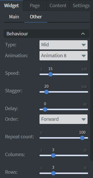
In the Behaviour Menu, you can customize the animation settings:
Animation Selection
Select an animation and type for your widget.
Speed Slide
Use the Speed Slide to set the speed of the animation.
Stagger Slide
Use the Stagger Slide to set how quickly the letters start to animate after each other.
Delay Slide
Use the Delay Slide to set the delay time between animation waves.
Animation Order
Set the order that the animation will start.
Repeat Count Slide
Use the Repeat Count Slide to set how many times the animation repeats.
Columns and Rows
Set the number of Columns and Rows for your widget.
Effects
In the Effects Menu, you can:
- Select a Background image or Color for your widget.
- Set the Opacity of the widget.
- Enable the Click through function to interact with other widgets behind this one.

Animation
In the Animation Menu, you can choose the Enter, Repeat, and Exit animations of your widget.

Bind to Data
You can use the Bind to data tool to select your Datasource.
Additional Properties
Under the Jump Menu, you can click on the three dots to access Additional Properties (aka MORE). However, this section is not detailed in the current documentation.