Carousel Widget
Properties
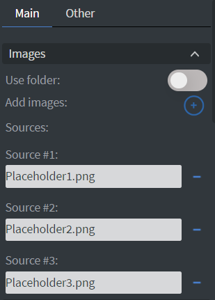
Images
In the Images Menu, you can select the images you want to display individually or select a folder to display all images in that folder.
Behaviour
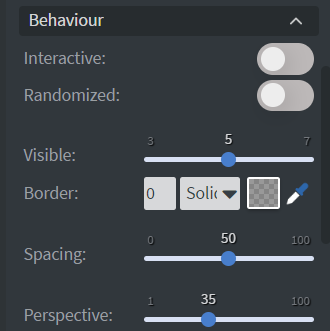
In the Behaviour Menu, you can customize the carousel settings:
- Create an interactive gallery to swipe between pictures on touch screens.
- Set the number of pictures shown.
- Add a border and set border width.
- Adjust the spacing and the perspective between pictures.
- Show and hide controls.
- Set scrolling time.
- Upload custom arrows.
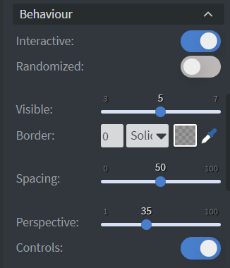
If you turn on the Interactive button in the Behaviour menu, the event values will appear in the Images menu.
By turning on the Interactive button, the button group and event name will appear in the Behaviour menu.
Interaction
In the Interaction Menu, you can choose different ways to control your element. The carousel can navigate through images using Actions.

Size & Position
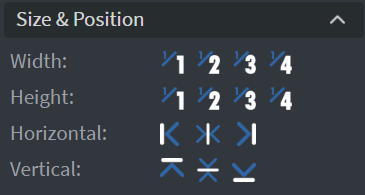
In the Size & Position Menu, you can adjust the width, height, and placement of your element.
Proof of Play
Learn more: Enable reporting (Content) and Enable reporting (Slide).
Effects
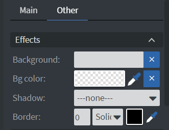
In the Effects Menu, you can select a Background image and Color for your element.
Animation
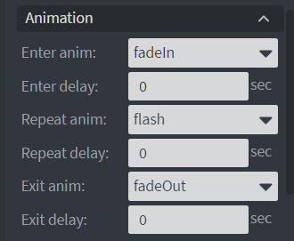
In the Animation Menu, you can choose the Enter and Exit animations of your element.
Additional Properties
Under the Jump Menu, you can click on the three dots to access Additional Properties (aka MORE). However, this section is not detailed in the current documentation.