Table Widget
Properties
Data
You can use the Bind to data tool to select your Datasource. Learn more: Data Binding.

File picker columns — image and video support
When a bound datasource column uses the File picker column type, the Table widget renders the referenced file inline in the cell. Supported file types:
- Images — rendered as an image inside the cell.
- Videos — played as a video inside the cell.
You can optionally set a custom size for the image or video inside the cell instead of using the cell's default sizing.
If you bind the Table widget to an internal datasource that uses a Folder picker column type, and the referenced folder contains a mix of images and videos at the same time, the cell rendering may behave unpredictably (some rows may render the wrong file type, fail to load, or display incorrectly).
Size & Position
In the Size & Position Menu, you can select the width, height, and placement of your widget quickly. Learn more: Size & Position.

Proof of Play
Proof of play is a reporting system that allows you to gain reports about used assets. If you turn on widget statistics, you can report information about the displayed duration, number of displays, and interaction events of this widget.

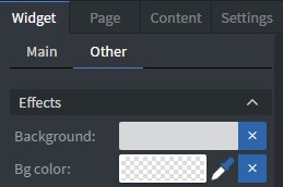
Effects
In the Effects Menu, you can add a background image or color to your widget.
Size & Position (Advanced)
In the advanced Size & Position Menu, you can change the size, position, and rotation of your widget.

Cell Style
In the Cell Style Menu, you can customize the appearance of your table cells:
- Font size.
- Font family.
- Style.
- Font color.
- Letter spacing.
- Text shadow.
- Letter case.
- Row height.
- Padding.
- Border.
- Background color.
- Vertical and Horizontal text layout.
- You can also enable Different header and Different even/odd styles.
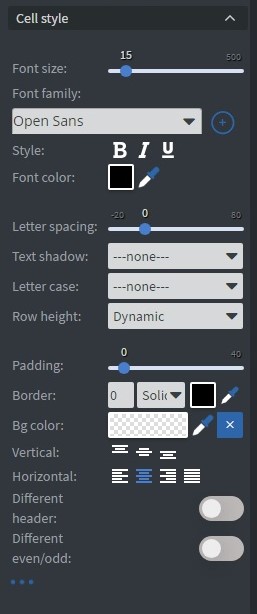
Table style
In Table style you can further customize the appearance of your table widget.
- Enable table height override: Allows customizing the table height to affect vertical alignment and layout.
The Table widget contains cells with defined heights. Text within each cell exists in a bounding box with independent height properties.
These are two separate height properties:
- Cell height: The total vertical space of the table cell
- Text bounding box height: The vertical space occupied by the text content
The Enable table height override option controls how much of the cell height the text bounding box fills, expressed as a percentage:
- 0%: Text uses only its natural height (no expansion)
- 50%: Text bounding box fills half the available cell height
- 100%: Text bounding box expands to match full cell height
The examples below demonstrate how vertical alignment settings affect text positioning with different table height override values:
Top alignment
'Enable table height override' at 0%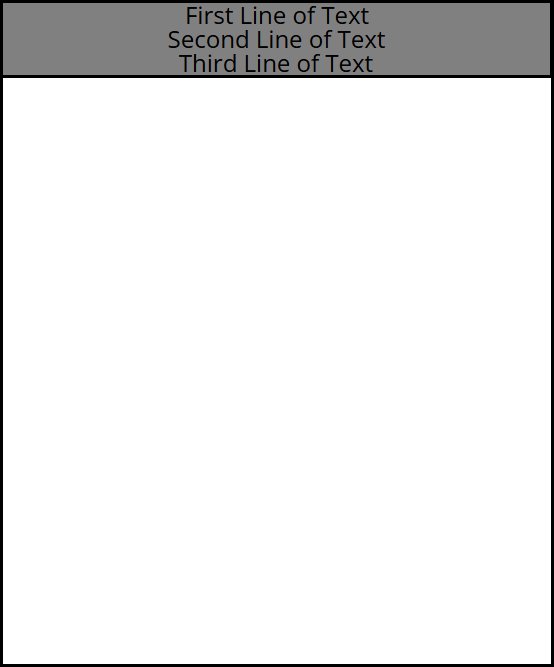 | 'Enable table height override' at 50%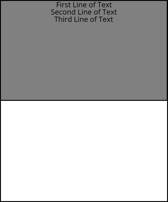 | 'Enable table height override' at 100%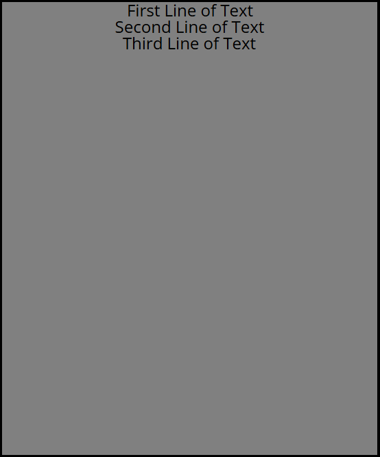 |
|---|
Middle alignment
| 'Enable table height override' at 0% | 'Enable table height override' at 50%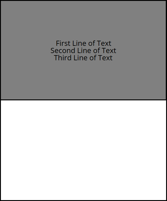 | 'Enable table height override' at 100%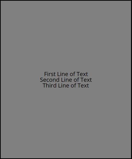 |
|---|
When 'Enable table height override' is set to 100%, longer text content may overlap with pagination information at the bottom of the table, depending on the selected alignment settings.
Additional Properties
Under the Jump Menu, you can click on the three dots to access Additional Properties (aka MORE). However, this section is not detailed in the current documentation.