Submit Widget
The "Submit button" will collect and submit the value of all interactive widgets in the content.
Properties
Button Menu
In the Button Menu, you can:
- Set your button group.
- Use an image as your submit button.
- Set the submit action type for your button:
- Call API.
- Report only.
- Enable "Do not reset" to prevent interactive widgets from resetting to their original values after submission.
Learn more: Interactive widgets and touch actions.
Proof of Play
Learn more: Enable reporting (Content) and Enable reporting (Slide).
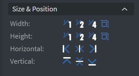
Size & Position
In the Size & Position Menu, you can select the width, height, and placement of your widget quickly. Learn more: Size & Position.
Effects
In the Effects Menu, you can select a background image or color for your widget.

Behaviour
By enabling Touch Actions, you can set up custom rules, such as interacting with other widgets, calling APIs, or navigating to other pages. Learn more: Interactivity.

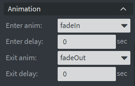
Animation
In the Animation Menu, you can choose the Enter and Exit animations of your widget. Learn more: Animation.
Additional Properties
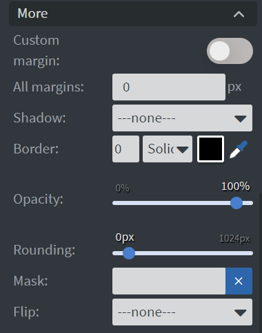
Under the Animation Menu, you can click on the three dots to access Additional Properties (aka MORE).
Custom Margin
Allows setting a custom-sized margin for your widget.
Shadow
Adds a shadow to your widget.
Border
Adds a border to your widget.
Rounding
Changes the transparency and rounds the edges of your widget.
Opacity
Adjusts the transparency of your widget.
Mask
Lets you select a PNG image to affect the shape of your widget. Learn more: Masking.
Flip
Allows flipping your widget horizontally, vertically, or both.
Hide Based On
Hides the widget based on data from a Datasource. If the datarow of the device and the given data are not the same, the widget will not appear on the device.
Background Color (BG Color)
Sets a background color for the widget from a Datasource.