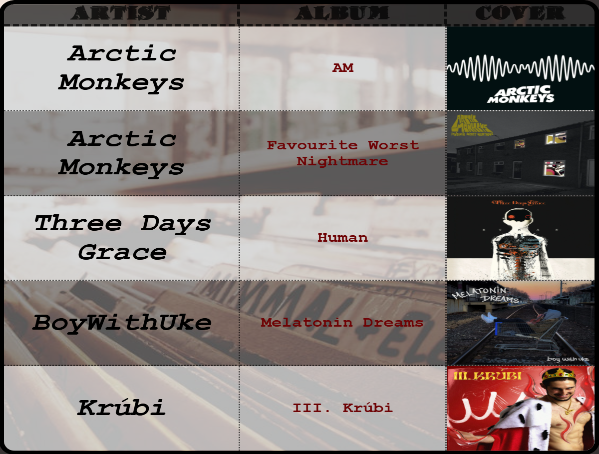
The Table appearance displays multiple data records in a configurable tabular format with support for various cell types,
conditional formatting, filtering, sorting, and pagination.
Settings
Data Settings
| Setting | Description |
|---|
| Column Keys | Define column structure (see Cell Types below) |
| Conditional formatting | Apply rules for styling based on values |
| Filtering | Filter rows based on conditions |
| Sorting | Sort data by column |
| Image folder | Folder to search for images (for [file] columns) |
| Base event ID | Identifier for table events (default: "table") |
| Number max value | Maximum value for [number] type columns |
| Progressbar max value | Maximum value for [progressbar] type columns |
| Color max value | Maximum value for [color] type columns |
How to define columns
Define which columns to display and their types. Enter one column per line in the Column Keys field.
[type][flags]columnKey|Alias
Column Types
Flags
Special format flags are used to add column specific styling, which overrides the settings inside the editor. These are:
| Flag | Description | Value |
|---|
size | Column width percentage | Number |
bgcolor | Background color | Color code |
fontcolor | Text color | Color code |
fontsize | Font size | Number |
bold | Bold text | None |
italic | Italic text | None |
underline | Underlined text | None |
h-align | Horizontal alignment | left, center, right |
v-align | Vertical alignment | top, center, bottom |
Examples
[text][bold]name|Employee Name
[italic]Id|Employee Id
[numberformat][size:25]salary|Annual Salary
[progressbar]progress
[date]startDate|Start Date
[file]avatar|Photo
Apply dynamic styling to cells based on data conditions.
Access via the "Conditional formatting" button to open the condition editor.
Filtering
Filter rows based on conditions. Only rows matching the filter are displayed.
Access via the "Filtering" button to open the filtering editor.
Sorting
Sorts the table rows by column values.
Access via the "Sorting" button to open the sorting editor.
Layout Settings
| Setting | Description |
|---|
| Table Orientation | Vertical (standard) or Horizontal (rotated) |
| Maximum num of rows | Limit displayed rows (0 = show all) |
| Table data row/column sizing | Auto (fit to container) or Fixed (specified %) |
| Data row/column fixed size | Size percentage when using Fixed sizing |
| Enable scrolling | Allow scrolling when content overflows (only with Fixed sizing) |
Background Settings
| Setting | Description |
|---|
| Enable Even-Odd Row styling | Alternate row colors for readability |
| Background Color | Uniform background (when Even-Odd is OFF) |
| Even-Row Background Color | Color for even-numbered rows |
| Odd-Row Background Color | Color for odd-numbered rows |
| Setting | Description | Range |
|---|
| Enable pagination | Split data across multiple pages | - |
| Pagination animation | Transition effect: None or Fade | - |
| Time on page | Seconds before auto-advancing | 5-300 |
| Setting | Description |
|---|
| Disable header | Hide the header row entirely |
| Background color | Header row background |
| Vertical alignment | Top, Center, or Bottom |
| Horizontal alignment | Left, Center, or Right |
| Font settings | Family, Size, Style, Color |
| Header Size | Height percentage of header row |
Border Settings
Outer Border
| Setting | Description |
|---|
| Border rounding | Corner radius for the table |
| Outer Border width | Thickness of outer border |
| Outer Border style | Solid, Dotted, Dashed, Double, Groove, Ridge |
| Outer Border Color | Color of outer border |
| Outer Border Placement | Every, Top, Bottom, Left, Right, Top-Bottom, Left-Right |
Inner Border
| Setting | Description |
|---|
| Inner Border width | Thickness of cell dividers |
| Inner Border style | Same options as outer border |
| Inner Border Color | Color of cell dividers |
| Inner Border Placement | Every, Vertical only, Horizontal only |
Separate width, style, and color settings for the header row border.
Visible only when scrolling is enabled
| Setting | Description |
|---|
| Sticky header | Keep header visible while scrolling |
| Size | Scrollbar width/height |
| Rounding | Scrollbar corner radius |
| Thumb Color | Scrollbar handle color |
| Thumb Hover Color | Handle color on mouse hover |
| Track Color | Scrollbar track background |
Cell Type Specific Settings
Text Cell
| Setting | Description |
|---|
| Vertical/Horizontal alignment | Cell content alignment |
| Font settings | Family, size, style, color |
Date Cell
| Setting | Description |
|---|
| Pattern | Format pattern (e.g., "YYYY-MM-dd", "dd/MM/YYYY HH:mm") |
| Use 12-hour format | Toggle AM/PM display |
| Locale Code | Localization (e.g., "en-US", "de-DE") |
| Alignment | Vertical and horizontal |
| Font settings | Family, size, style, color |
| Setting | Description |
|---|
| Separator | Thousands separator |
| Decimal Separator | Character for decimal point |
| Decimal points | Number of decimal places (-1 = keep original, 0-4) |
| Prefix/Suffix | Text before/after number |
| Currency Symbol | Currency indicator |
| Currency Position | Prefix or suffix |
| Compact mode | Display as 1K, 1M, 1B |
| Compact threshold | When to start compacting |
| Percentage mode | Display as percentage |
| Percentage multiply | Multiply by 100 for percentage |
Image Cell
| Setting | Description |
|---|
| Image fit | Stretch, Cover, or Contain |
Sensor Events
Events use the configured eventId setting, as the prefix (default: table).
| Event Name | Payload | Trigger |
|---|
| eventId-page-changed | page index | Page navigation occurred |
| eventId-pages-count-changed | total pages | Total page count changed |
| eventId-clicked | pageIndex, rowIndex, cellIndex, cellValue, datasourceValue | Cell was clicked |
External Commands
| Command | Parameters | Description |
|---|
setTablePageTo | value: number | Navigate to page index |
setTableIndexNext | none | Go to next page |
setTableIndexPrev | none | Go to previous page |