Progressbar Appearance
The Progressbar appearance visualizes the value as a percentage of the maximum, displayed as various progress indicator styles.
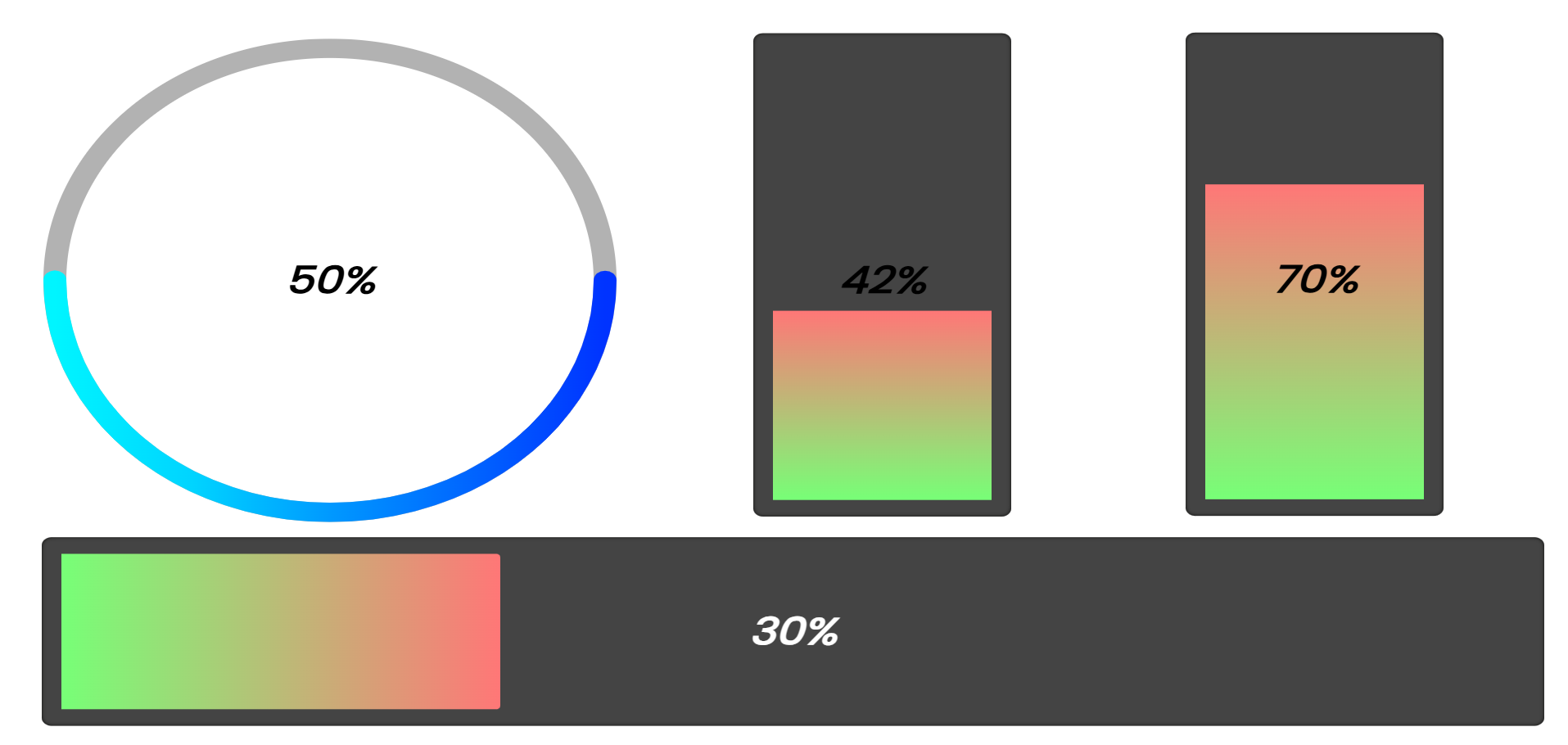
Progressbar Styles
| Style | Description |
|---|---|
| Linear Progressbar | Horizontal bar that fills from left to right |
| Vertical Progressbar | Vertical bar that fills from bottom to top |
| Circular Progressbar | Ring/circle that fills clockwise |
Settings
Common
| Setting | Description | Default |
|---|---|---|
| Progressbar background color | Color of the unfilled portion | #444 |
| Progressbar inner shadow color | Color of the inner shadow effect | #0c0c0a |
| Progressbar inner shadow size | Size of the inner shadow (0-50px) | 5 |
| Progressbar inner padding | Space between bar edge and progress (0-50) | 5 |
| Progressbar Rounding | Corner radius of the bar (0-250px) | 40 |
| Progress indicator rounding | Whether the progress fill has rounded ends | true |
| Show Percentage | Display the percentage value as text | false |
Circular Progressbar Specific Settings
| Setting | Description | Default |
|---|---|---|
| Circle Stroke Width | Thickness of the circular progress ring (1-200px) | 12 |
| Line Cap Style | End style of the progress arc: Rounded or Flat | round |