Introduction
This article introduces you to our custom Weather app and its core features.
The Weather app is deployed to customer servers per request. To learn more contact our support at sales@wallboard.info!
This custom app is under active development and any information in this documentation could be inaccurate or outdated! If you have any questions please contact our support at support@wallboard.info
What is Weather?
With the Weather app you can easily display real-time weather data from anywhere in the world, ensuring your customers stay informed.
Setting up the widget
Location Settings
You can set any city using the following methods:
- By city
- By longitude/lat
- By device
- By easy editing
- By datasource
- City id: Enter the city name or ZIP code here.
- Display name: Enter the actual city name or a custom "nickname" to display on the screen.
- Country Code: Select the country from a dropdown list. (The list also includes U.S. county codes as selectable options.)
- Longitude
- Latitude
This feature is not yet supported.
This option automatically uses the device's weather location (if available). To configure this, go to Devices, then select your device → Settings → Weather Location.
- City: Select from a dropdown list of major cities. It will automatically translate into the local language if supported. (e.g., Abu Dhabi → أبو ظبي).
See a detailed guide on the next page.
Language Code: Choose the language in which you want the widget to display data.
Weather settings
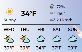
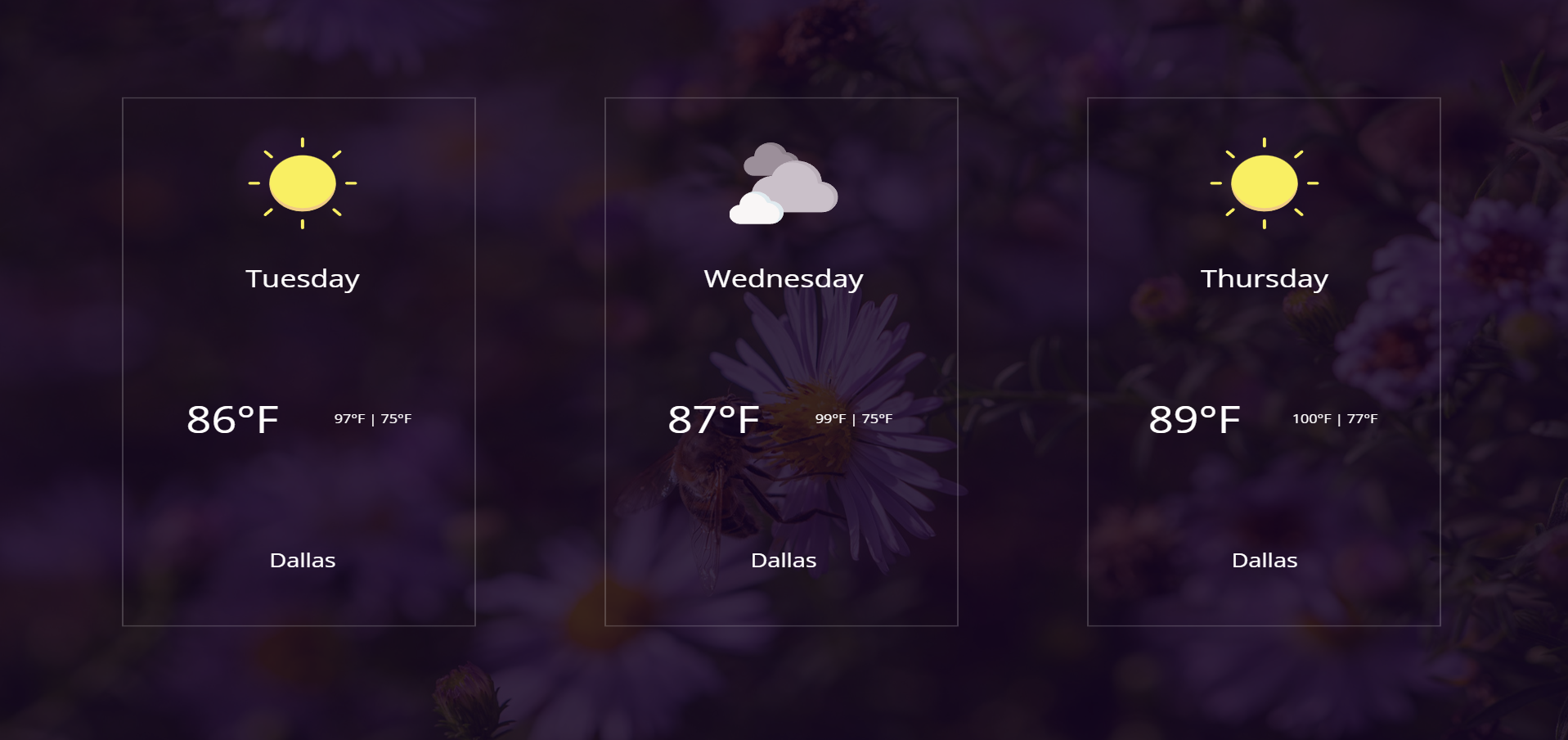
- Widget type: Choose between Forecast and Today.
- Layout: Select from various layouts to display weather data.
- Icon set: Set the displayed weather icon type
- Unit: Select between Fahrenheit (Imperial) or Celsius (Metric).
- Unit format: Customize the styling of unit displays.
- Active background: Enable a dynamic background that changes based on weather conditions.
- Overlay color: Set a semi-transparent overlay between the background image and the weather data.
Designer Settings
- Advanced Settings: Enable additional customization options.
Active Background Settings
Choose from pre-made image sets that visually reflect current weather conditions.
This image set acts as the widget background.
If Image Only is enabled, only the image and overlay will be shown.
Additional styling options:
- Effects
- Grayscale
- Transparency
- Blur
Customization Settings
- Auto Image Size: Enable auto-sizing for images. (If disabled, a manual slider will appear.)
- Date Format: Define how dates are displayed.
- Relative Days Format: Customize how days are labeled (e.g., "Tomorrow", "In 3 days"). Defaults to English if not supported.
- Inner Padding: Adjust spacing between forecast elements.
- Short Day Name: Use abbreviations like "Fri" instead of "Friday".
- Add Before Min: Add text before minimum temperature (e.g., "min: 32°F").
- Add Before Max: Add text before maximum temperature (e.g., "max: 72°F").
Day Cards (Lower Menu)
- Background Color: Set the background color for day cards.
- Rounding: Set the corner radius of day cards.
- Side Padding: Set internal padding for day cards.
Widget Layout
- Outer Padding: Set padding for the entire data inside the widget.
Forecast-Only Settings:
These settings only apply when the Forecast widget type is selected:
- Days: Number of forecast days to display.
- Skip Days: Omit a number of days from the beginning of the forecast.
- Type: Choose between Vertical and Horizontal layout.
- Gap: Set spacing between forecast elements.
The following fields are not supported by forecast type: Wind, Atmosphere, Astronomy
Additionally, you have full control over font styling, including:
- Font Color
- Bold, Italic, Underline
- Text Capitalization
Enable No Line Breaks to ensure all text stays on a single line per cell.
You can also enable Cell Settings for more granular control.
Cell Settings
Customize each cell's content and appearance:
- Content Selector: Choose display content (temperature, date, astronomy, etc.)
- Text Size Multiplier: Adjust text size relative to global settings.
- Style: Enable underline, italic, or bold.
- Font Color: Define text color.
- Vertical: Set vertical alignment.
- Horizontal: Set horizontal alignment.
- Cell Size Multiplier: Tip: Use this together with Helper Settings → Show Borders. This helps you visually see the layout changes. The multiplier controls the size of the current cell relative to the others.
Unique cases in cell settings
If Atmosphere or Wind is selected, additional options are available:
- Type: Choose specific data to display, such as humidity, visibility, or both.
- Text before: Add a prefix before the field (e.g., displaying Wind: 1.0 km/h instead of just 1.0 km/h).
- Text after: Add a suffix after the field.
Helper Settings:
- Show borders: Enable visible borders to see your layouts sheet better.
- Cell border color: Change the color of your borders (Not available in readyToUse layouts)
Touch events
- Set location: Changes the city by Location and Country code