Shape Widget
The Shape widget allows you to create several types of shapes in your content.
Properties
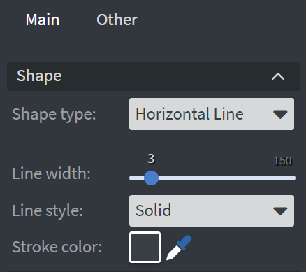
Shape
In the Shape Menu, you can:
- Select the type of your shape.
- Set the width of the line for your shape (from 3 to 150 pixels).
- Choose the style of the shape.
- Set the stroke color.
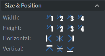
Size & Position
In the Size & Position Menu, you can select the width, height, and placement of your widget quickly.
Proof of Play
Proof of play is a reporting system that allows you to gain reports about used assets. If you turn on widget statistics, you can report information about the displayed duration, number of displays, and interaction events of this widget.

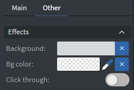
Effects
In the Effects Menu, you can:
- Select a background image or color for your widget.
- Enable the Click through function to allow interaction with widgets behind this one.
Animation
In the Animation Menu, you can choose the Enter, Repeat, and Exit animations for your widget.

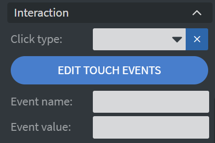
Interaction
In the Interaction Menu, you can:
- Choose a Click type interaction.
- Set a Touch sound for your widget.
Additional Properties
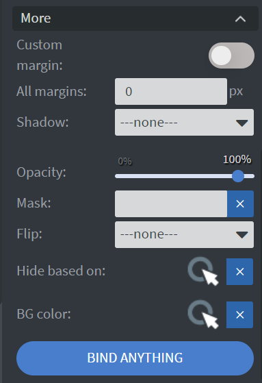
Under the Jump Menu, you can click on the three dots to access Additional Properties (aka MORE).
Custom Margin
Allows you to set a custom-sized margin for your widget.
Shadow
Adds a shadow to your widget.
Opacity
Changes the transparency and rounds the edges of your widget.
Mask
Lets you select a PNG image to affect the shape of your widget. Learn more: Masking.
Flip
Allows you to flip your widget horizontally, vertically, or both.
Click Through
Enables clicking through the widget to interact with other widgets behind it.
Hide Based On
Hides the widget based on data from a Datasource. If the datarow of the device and the given data are not the same, the widget will not appear on the device.
Background Color (BG Color)
Sets a background color for the widget from a Datasource.