Image Widget
The Image widget allows you to add pictures to your content.
Properties settings
Image
Source
Under the Image Menu you can set the source picture of your widget.
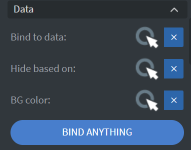
Bind to data
With Bind to data you can set your source with data sources.

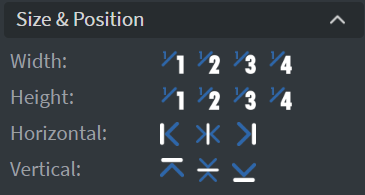
Size & Position
Adjust dimensions
In the Size & Position Menu you can select the width, height, and placement of your widget quickly.
Proof of Play
Proof of play is a reporting system that allows you to gain reports about used assets.
Widget statistics
If you turn on widget statistics, you can report information about the displayed duration, number of displays, and interaction events of this widget.
Asset statistics
If you turn on asset statistics, you can report information about the displayed duration, number of displays, and events of each media asset inside this widget.

Effects
Background customization
In the Effects Menu, you can select a Background image or Color for your widget.
Click through
Enabling the Click through function allows you to click through the widget and interact with other widgets behind this one.
Shadow & Border
Here you can add a Shadow and Border to your widget.
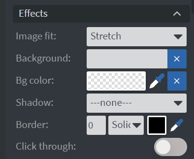
Image fit
Image fit refers to how an image is resized or scaled to fit within a given space.
Cover
The image is scaled up or down to completely fill the space, which may result in the image being cropped.
Contain
The image is scaled to fit within the space, without cropping, resulting in empty space around the image if the aspect ratio of the image and container don't match.
Stretch
The image is stretched to fit the entire space, regardless of its original aspect ratio, which may result in image distortion.

Animation
Enter & Exit Animation
In the Animation Menu, you can choose the Enter and Exit animation of your widget.

Bind to data
Datasource Selection
You can use the Bind to data tool to select your Datasource.
Hide based on
You can hide the widget based on data from a Datasource.
BG color
You can give a background color for the widget from a Datasource.
If the data row of the device and the given data are not the same, the widget will not appear on the device.
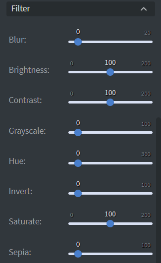
Filter
Image modification
The Filter Menu allows modification of your image with different types of filters.