Scroll Widget
The Scroll widget allows you to scroll various types of texts.
Properties
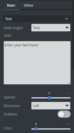
Text
In the Text Menu, you can select between three types of outputs:
- Simple Text: Manually type the text that you want to display.
- Message Board: Display saved messages from our Message Board. Learn more: Message Board.
warningPlease note that the Messages menu is deprecated in the 2.0 UI. If you wish to continue using this functionality, you’ll need to switch to the 1.x user interface.
- RSS type: Display information brought in via an RSS URL.
You can also set the speed, direction, and trim of your widget. Enabling the Endless function is recommended when you want to display long texts in the widget.
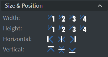
Size & Position
In the Size & Position Menu, you can select the width, height, and placement of your widget quickly.
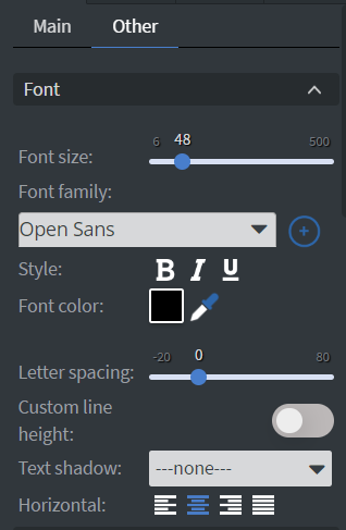
Font
On the scroll widget, in the Font Menu, you can set the Size, Font family, Style, and Color of the font. You can also set Letter spacing and Shadow here.
Proof of Play
Proof of play is a reporting system that allows you to gain reports about used assets. If you turn on widget statistics, you can report information about the displayed duration, number of displays, and interaction events of this widget.

Effects
In the Effects Menu, you can select a Background image or Color for your widget.

Animation
In the Animation Menu, you can choose the Enter, Repeat, and Exit animations of your widget.

Bind to Data
You can use the Bind to data tool to select your Datasource. With the Font color data binder, you can add a color to your text in the widget from a Datasource. You can set After and Before text to display before or after the main text.

Jump
In the Jump Menu, you can set up the Jump on end function. When enabled, this option allows jumping to the selected page at the end of the scrolling text, but it won't work if the element is set to loop or has an exit animation applied.

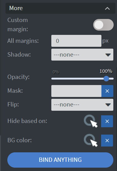
Additional Properties
Under the Jump Menu, you can click on the three dots, which will show Additional Properties (aka MORE).
Custom Margin
Allows you to set a custom-sized margin to your widget.
Shadow
Adds a shadow to your widget.
Opacity
Changes the transparency and rounds the edges of your widget.
Mask
Lets you select a PNG image to affect the shape of your widget. Setting the trim in the widget's main settings greater than 0 will ignore the selected masking image. Learn more: Masking.
Flip
Allows you to flip your widget horizontally, vertically, or both.
Click through
Enables clicking through the widget to interact with other widgets behind it.
Hide based on
Hides the widget based on data from a Datasource. If the datarow of the device and the given data are not the same, the widget will not appear on the device.
Background Color (BG color)
Sets a background color for the widget from a Datasource.