Room Planner
Room planner widget type can visualize your timetable. In the Room Planner settings block, you can customize the widget's appearance and functionality. This widget type supports table settings and displays the room’s schedule according to the selected configuration.
Widget Style Options
You can choose from the following widget styles:
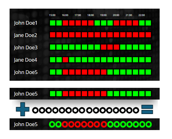
- Horizontal: The planner displays boxes horizontally, indicating whether the room is occupied or not. The box colors are derived from the Room settings.
- Vertical: Similar to Horizontal, but the boxes are arranged vertically.
- Horizontal Time Stamps: Displays time stamps horizontally according to the resolution and period. Cells show the time labels instead of just colors.
- Vertical Time Stamps: Displays time stamps vertically according to the resolution and period. Cells show the time labels instead of just colors.
Configuration Options
Resolution
Set the time resolution to control how detailed the schedule is displayed:
- 15 minutes (default): Each cell represents a 15-minute time slot.
- 30 minutes: Each cell represents a 30-minute time slot.
- 60 minutes: Each cell represents a 1-hour time slot.
Period
Choose the time period for the planner to define how much of the day is shown at once:
- 1 hour: Display 1 hour of schedule.
- 2 hours: Display 2 hours of schedule.
- 4 hours (default): Display 4 hours of schedule.
- 8 hours: Display 8 hours of schedule.
- 12 hours: Display 12 hours of schedule.
- 24 hours: Display the full day.
Timestamps
Set which time stamps to display (only visible for Horizontal Time Stamps and Vertical Time Stamps styles):
- All (default): Displays a time stamp for every cell.
- Every Second: Displays a time stamp for every other cell (index divisible by 2).
- Every Fourth: Displays time stamps for every fourth cell (index divisible by 4).
Time Stamp Alignment
Choose how the time stamps should be aligned:
- Left: Align to the left side.
- Center: Align to the center.
- Right: Align to the right side.
Rotation
Enable or disable a 90-degree rotation on the time stamp text for a different visual layout (checkbox). Default: disabled.
Room Settings
In this section (visible only for Horizontal and Vertical styles), you can modify the colors representing various statuses:
- Free: The color indicating when the room is available. Default: #00ff00 (green).
- Busy: The color indicating when the room is occupied. Default: #ff0000 (red).
- Almost Started: The color used when a meeting is about to begin (defined by the "Almost started minutes" setting). Default: #ffff00 (yellow).
Almost started minutes
Set the number of minutes before an event starts that the room will be highlighted in the Almost Started color. This allows for a visual indicator when the meeting is approaching.
Table Settings
Table settings are available for the Room Planner widget:
- Cell Border Color: Customize the border color of the planner cells. Default: #000000.
- Cell Border Width: Set the border width in pixels (0-10). Default: 0.
Other Settings
In the widget's Other tab, you can upload semi-transparent masking images to enhance the visual appearance of the widget.
Here is an example: