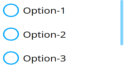
Radio
What is the Form Radio Button?
With the radio button form type, you can select one item from a list of options. In the settings, you can set the given items and have some general formatting options.

Options
Values
- Specifies the selections that will be rendered. Selections are separated by new lines, and each new line (enter press) is a new entry. Clear entries won't show up.
- Each entry can be specified by a tag to be ��‘selected’, ‘correct,’ or both at the same time. The tags are cut off, and the rendered label won’t contain them.
- Specifying tags:
[!]- Correct entry[*]- Selected entry[!*]or[*!]- Selected entry that is also correct
Examples:
[*]Largewill be rendered asLargeand will be selected.[!*]Smallwill be rendered asSmalland will be selected and marked as correct at the same time.
Button Style
Specifies how the radio buttons will look.
None
- No box will appear; the label itself is the radio button.
Rectangular
- Rectangular styled boxes appear.
Rounded
- Rounded styled boxes appear.
Color
- No label will appear; the label of the box is treated as a color code, and the box's circle is filled with that color.
Width Mode
- Specifies the generated boxes' width mode.
- Possible values:
- Default: Only takes up the space it needs.
- Auto: Every box takes up the same space.
- Fixed: Every box takes up at least the specified space.
Additional Settings
- Primary Color: Specifies the primary color used by the boxes, affecting both the box and the selected background color.
- Unselected Background Color: Specifies the unselected buttons' background color.
- Unselected Font Color: Specifies the unselected buttons' font color.
- Background Rounding: Specifies the rounding of the buttons' backgrounds.
- Direction: Specifies the flex direction used by the widget. Possible values:
- Column
- Row
- Column-Reverse
- Row-Reverse
Setting Mock Field and Own Value
The radio button sets its own value and the mock value simultaneously. This occurs when:
- The radio button is rendered. If selected boxes are generated, the Mock and Own values will contain those values.
- Every selection made.
- When an external message tells it to change values or selections.
Validation
- If validation is enabled, the form evaluates the selection.
- If the correct option is selected, the field is marked as valid. If an incorrect option is selected, the field is marked as invalid.
- If "Show Validation" is enabled in the Error Settings, the field's validity will be visually indicated by a border.
Sensor Events
-
The radio button sends out one external message when its validity is evaluated.
{FORM-NAME}-valid value: [true/false]{FORM-NAME}is the name assigned to the radio button.- The value will be
trueorfalsedepending on the validation result.
Example:
example-radio-button-valid -> true
External Messages
The radio button listens to three basic external messages:
- Set Form: Takes the value from the message, splits it like the Values option in the editor, and replaces the selections with new options. It updates both the Mock and Own values. If the message results in no selection, it is ignored.
- Clear Form: Removes the current selection and clears both the Mock and Own values.
- Reset Form: Restores the radio button to its initial state. Validation is reverted to default but not cleared.
Value from Datasource
- If an external datasource array is assigned to the radio button, it converts the array elements into selectable options the same way as the Values option and places them accordingly.