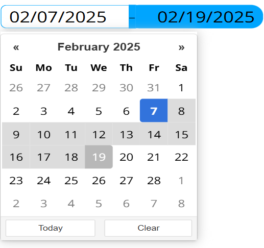
Date Range
What is the Form Date Range?
The Date Range or Date Range picker is used, as the name suggests, as a date-range picking field, which can be styled to your preference.

Options
- Position
- Language
- Date format
- Title
- Set today as default
- Highlight today's date
- Show today button
- Show clear button
- Border radius
- Color
Specifies where the date picking pop-up should appear, relative to the activation button.
Specifies the language of the Date picker.
Specifies the date format used by the Date picker.
Specifies the title that appears on the Date picker pop-up.
Specifies whether the default date should be today.
Specifies whether today's date should be highlighted or not in the Date picker.
Specifies whether the show today button should appear on the Date picker or not.
Specifies whether the clear button should appear in the Date picker.
Specifies Date pickers border radius.
Specifies the color of the Date picker.
Setting Mock field and own value
The Date picker updates the own value and the mock if it can, when:
- When the Date picker is rendered.
- When a selection is made.
- An external message tells it to.
Validation
The Date picker doesn't validate itself.
Sensor Events
The Date picker doesn't send out sensor events.
External Messages
The Date picker listens to all the basic messages.
- Set Form: Takes the messages value and sets it as the selected date, saves it to Mock and updates the own value. Note: The messages value should be in the format of the Date picker. If not the setting of the date can result in undesired outcomes.
- Clear/Reset Form: Clears the selection to empty, clears the mock and the own value.
Value from Datasource
The Date picker doesn't support values from datasource.