Image Selector
What is the Form Image Selector?
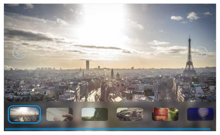
With the Image selector you can create an image selecting field. There is 2 styles for it:
- Default
- Carousel

Options
- Widget type
- Select images
- Accent color
Specifies the working mode of the image selector. Also changes how the selector looks.
Specifies the images that appears on the selector.
Specifies the color that appears on the selector.
- Default specific options:
- Show navigation bar
- Image fit
Specifies whether the navigation bar should appear or not.
Specifies the fit type of the images.
Setting Mock field and own value
The image selector takes the currently selected image's URL and sets the own value and tries to the set mock to it, when:
- the image selector is loaded,
- another image is selected,
- an external message tells it to change value.
Validation
The image selector doesn't validate the selection.
Sensor Events
The image selector doesn't send any sensor events.
External Messages
The image selector listens to the three basic external messages:
- Set Form: Takes the value from the message, splits it up by the
;(semicolons), and replaces the images with the new images. Updates the Mock and own value accordingly.- Clear / Reset Form: Reverts to the default state. Updates the mock and the own value accordingly.
And it also listens to its own messages:
- Go to next image: Goes to the next image. Updates the Mock and own value accordingly.
- Go to previous image: Goes to the previous image. Updates the Mock and the own value accordingly.
- Specify image to show by index: Goes to the image on the specified index. Updates the Mock and the own value accordingly.
Value from datasource
The image selector takes the images from the datasource and adds it to the other values.
The datasource has to be a string array, which contains the URL-s to the images.