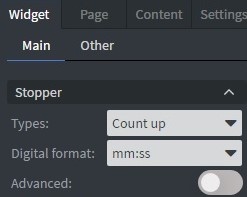
Stopper Widget
With the Stopper Widget, you can use the stopper option and choose types, digital formats.
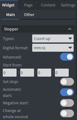
It has an Advanced option. If you turn it on, you can set stop, automatic start, negative start, and change at the whole second.
Properties
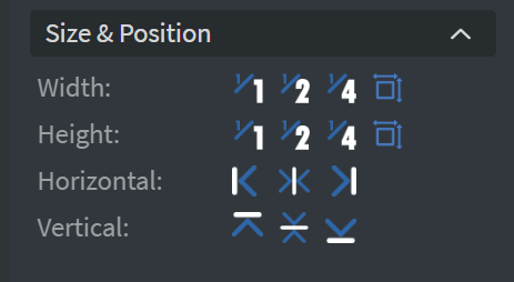
Size & Position
In the Size & Position Menu, you can select the width, height, and placement of your widget quickly. Learn more: Size & Position.
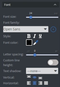
Font
In the Font Menu, you can customize the text appearance:
- Font size.
- Style.
- Color.
- Letter spacing.
- Custom line height.
- Text shadow.
- Dynamic font size.
- Vertical and Horizontal text layout.
Proof of Play
Proof of play is a reporting system that allows you to gain reports about used assets. If you turn on widget statistics, you can report information about the displayed duration, number of displays, and interaction events of this widget.

Effects
In the Effects Menu, you can select a background image or color for your widget.

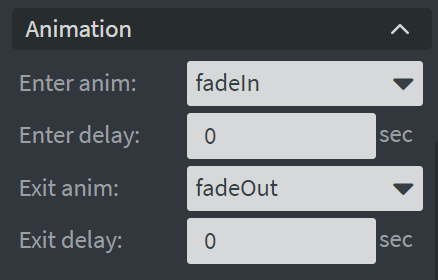
Animation
In the Animation Menu, you can choose the Enter and Exit animations of your widget. Learn more: Animation.
Additional Properties
Under the Animation Menu, you can click on the three dots to access Additional Properties (aka MORE). However, this section is not detailed in the current documentation.