CheckBox Widget
With the CheckBox widget, you can create interactive check boxes. In your content, you can check none, just one, or multiple check boxes of the same Button Group.
Properties
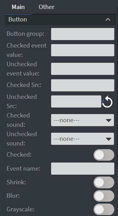
Button
In the Button Menu, you can:
- Set the name of your button group.
- Define unchecked and checked values.
- Set your widget to be checked at the start of your content.
- Upload checked and unchecked images.
- You can also shrink, blur, or make your widget grayscale while it is unchecked.
- Event name is not necessary to fill.
- If the check value is empty but the Checkbox has been checked, it will get the default 'Checked' string.
- You can set a Checked and Unchecked sound which will be played when the widget goes to the checked/unchecked state.
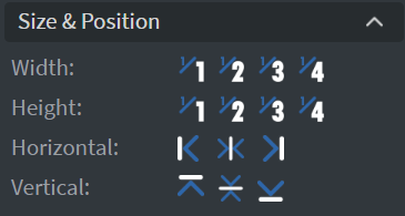
Size & Position
In the Size & Position Menu, you can select the width, height, and placement of your widget quickly.
Effects
In the Effects Menu, you can select a background image or color for your widget.

Proof of Play
Proof of play is a reporting system that allows you to gain reports about used assets. If you turn on widget statistics, you can report information about the displayed duration, number of displays, and interaction events of this widget.

Behaviour
In the Behaviour Menu, you can set Touch actions for the widget.

Animation
In the Animation Menu, you can choose the Enter and Exit animations of your widget.

Additional Properties
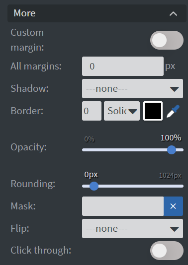
Under the Animation Menu, you can click on the three dots to access Additional Properties (aka MORE).
Shadow
Adds a shadow to your widget.
Border
Adds a border to your widget.
Rounding
Changes the transparency and rounds the edges of your widget.
Opacity
Adjusts the transparency of your widget.
Mask
Lets you select a PNG image to affect the shape of your widget.
Click Through
Enables clicking through the widget to interact with other widgets behind it.
Hide Based On
Hides the widget based on data from a Datasource. If the datarow of the device and the given data are not the same, the widget will not appear on the device.
Background Color (BG Color)
Sets a background color for the widget from a Datasource.