Table Widget
Properties
Data
You can use the Bind to data tool to select your Datasource. Learn more: Data Binding.

Size & Position
In the Size & Position Menu, you can select the width, height, and placement of your widget quickly. Learn more: Size & Position.

Proof of Play
Proof of play is a reporting system that allows you to gain reports about used assets. If you turn on widget statistics, you can report information about the displayed duration, number of displays, and interaction events of this widget.

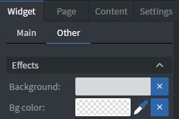
Effects
In the Effects Menu, you can add a background image or color to your widget.
Size & Position (Advanced)
In the advanced Size & Position Menu, you can change the size, position, and rotation of your widget.

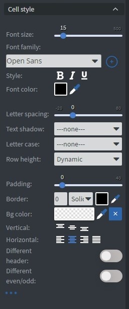
Cell Style
In the Cell Style Menu, you can customize the appearance of your table cells:
- Font size.
- Font family.
- Style.
- Font color.
- Letter spacing.
- Text shadow.
- Letter case.
- Row height.
- Padding.
- Border.
- Background color.
- Vertical and Horizontal text layout.
- You can also enable Different header and Different even/odd styles.
Additional Properties
Under the Jump Menu, you can click on the three dots to access Additional Properties (aka MORE). However, this section is not detailed in the current documentation.