PDF Widget
Properties >> Widget >> Main
Documents
In the Documents menu you can manage the sources you chose to use in the widget.
- With the add button you can select manually the elements with pdf file type.

- If you enable the USE FOLDER option, you can select a whole folder that contains pdf type elements.


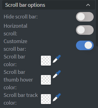
Scroll bar options
Here you can customize the scrollbar of the pdf widget
 |
|---|
Behaviour
In Behaviour menu you can manage the widget's behaviour, such as padding, randomization, scrolling and even if your pdf file is protected by password, you can add the required password.
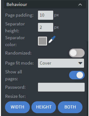
- If you disable the Show all pages, you can set the start and the end page number.

- You can set the page separator's color between pdf files
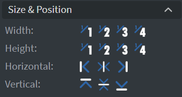
Size & Position
In the Size & Position Menu you can select the width, height, and placement of your widget quickly.
Proof of Play
Proof of play is a reporting system, that allows you to gain report about used assets. If you turn on widget statistics you can report information about the displayed duration,number of displays and interaction events of this widget. If you turn on asset statistics you can report information about the displayed duration, number of displays and events of each media asset inside this widget

Properties >> Widget >> Other
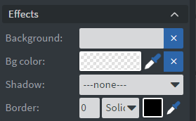
Effects
In the Effects Menu you can select a 'Background image' or 'Color' to your widget.
Here you can add a 'Shadow' and 'Border' to your widget.
Animation
In the Animation Menu you can choose the 'Enter and Exit animation' of your widget.

Data
You can use the 'Bind to data' tool to select your Datasource.

Interaction
In the Interactions menu you can add End actions

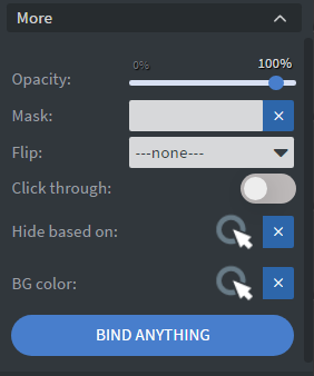
Additional Properties
Under the Interactions Menu you can click on the three dots which will show Additional Properties called MORE.
-
The 'Opacity' sliders, will change the transparency and round the edges of your widget.
-
The 'Mask' option will let you select a PNG image to affect the shape of your widget.
-
You can also flip your widget horizontally, vertically, or both with the 'Flip' function.
-
The 'Click through' function allows you to click through the widget and interact with other widgets behind this one.
-
With 'Hide based on' data binder you can give a data from a datasource to the widget.
- If the datarow of the device and the given data are not the same, the widget will not appear on the device.
-
With 'BG color' data binder you can give a background color for the widget from a Datasource.