Introduction
This article introduces you to our custom Value app and its core features.
The Value app is deployed to customer servers per request. To learn more, contact our support at sales@wallboard.info!
This custom app is still a under active development prototype which hasn't been released yet. Any information in this documentation could be inaccurate or outdated! If you have any questions, please contact our support at support@wallboard.info
Overview
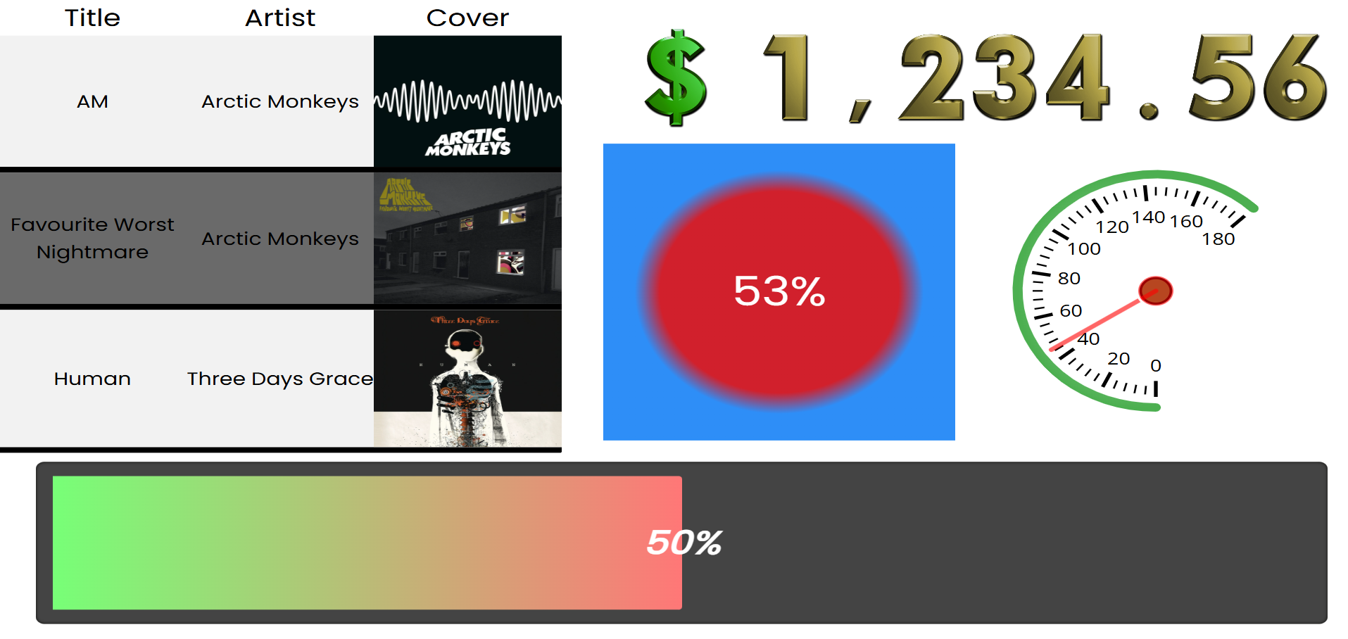
The Value Widget is a custom Wallboard widget that displays and manages numeric values in various visual formats. It supports both single value display and multi-value modes (tables, charts), with extensive customization options for appearance, animation, and interactivity.
What Can You Use It For?
- Progress tracking with animated progress bars
- Data tables with conditional formatting
- Gauges for showing values within ranges (speedometer style)
- Color-based indicators showing percentages
- Character/icon-based visual representations
- Interactive counters that can be controlled externally
Key Features
- Multiple visualization styles (Number, Progressbar, Color, Gauge, Characters)
- Animated transitions between values
- Conditional formatting for tables
- Data filtering and sorting
- External command support for interactivity
- Custom font image support for scrolling numbers
- Configurable min/max value ranges
Quick Start
- Add the Value Widget to your Wallboard page
- Select the Value Mode (Single or Multi)
- Choose an appearance style
- Bind a data source (depending on the work mode and desired appearance, optional)
- Configure appearance-specific settings
- Adjust font and styling options
Work Modes
Single Value Mode
Displays and manages a single numeric value with various visual representations.
Features:
- Interactive (non-read-only) or read-only display
- Configurable min/max/default values
- Step-based increments/decrements
- Optional reset at maximum value
- Data source binding
More about the Single mode and its appearances here.
Multi Value Mode
Displays multiple values from a data source in structured formats.
Available appearances:
- Table - Displays data in rows and columns with customizable cell types
- Charts - Displays data as charts
More about the Single mode and its appearances here.
Global Settings
Mode Settings
| Option | Type | Description |
|---|---|---|
| Value mode | select | single or multi |
| Value from datasource | dataPicker | Bind to external data source |
| Animation speed | slider | 0-10, controls animation speed |
Font Settings
Global font settings available for all appearances:
| Setting | Description |
|---|---|
| Font Family | Select from available system and web fonts |
| Font Size | Base text size in pixels |
| Font Style | Normal, Italic, or Oblique |
| Font Weight | Normal, Bold, or specific weights (100-900) |
| Font Color | Text color |
| Text Decoration | None, Underline, Overline, Line-through |
Affected Components
These settings affect:
- Number display text
- Character display text
- Gauge tick labels
- Color percentage overlay
- Progressbar percentage text