Checkout
This article introduces you to our custom Checkout app and its core features.
Important Information
The Checkout app is deployed to customer servers per request. To learn more, contact our support at sales@wallboard.info!
This custom app is under active development and any information in this documentation could be inaccurate or outdated! If you have any questions, please contact our support at support@wallboard.info.
What is Checkout?
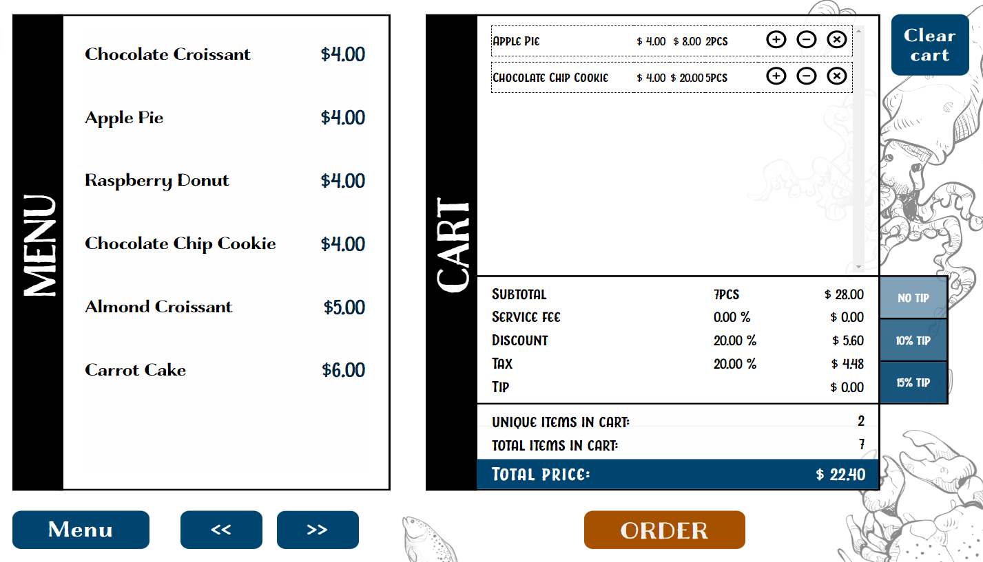
With the Checkout app, you can easily create a straightforward self-service ordering process. To utilize the functionalities of the Checkout app, use it alongside our MenuBoard app.
Prerequisites
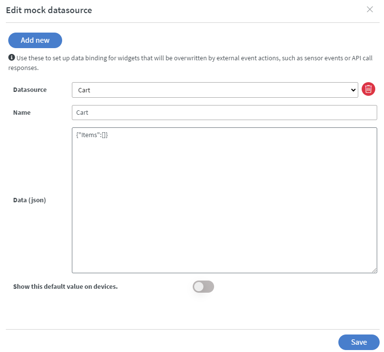
To keep track of orders, the Checkout app needs a mock datasource. This mock datasource must be the same as your ordering selector MenuBoard's target dataset.
If you don't already have a mock datasource, go to Content tab > Base data path > Edit mock datasource, then click add new. Name your datasource and insert the following into the data (JSON) field: {"Items":[]}
Setting up the Widget
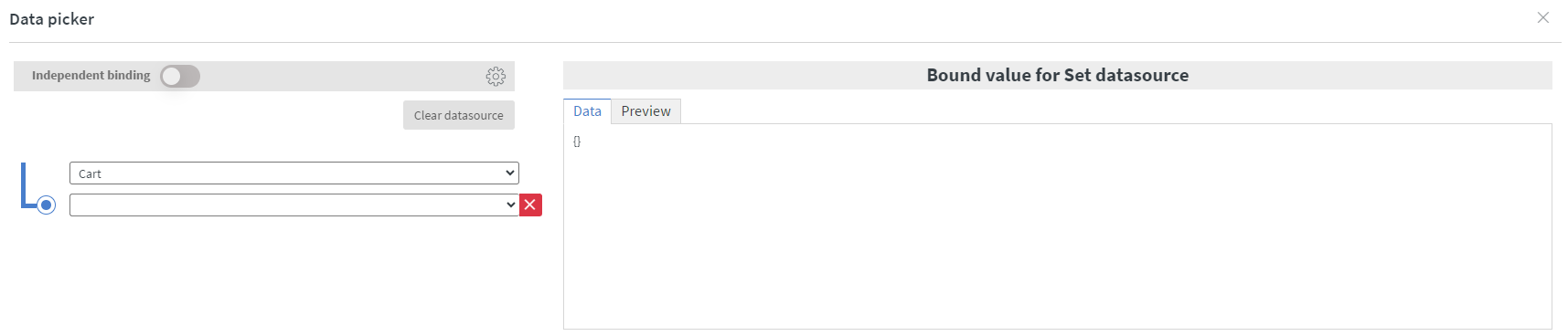
Datasource Binding
After successfully creating your mock datasource, place the Checkout app widget and configure the datasource binding. Ensure you select the same mock datasource that you use as your MenuBoard's target dataset.
Layouts
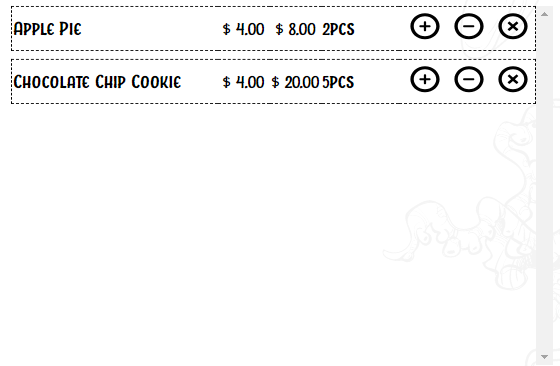
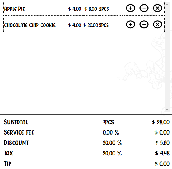
Cart
In the cart layout style, the contents of your cart are displayed:
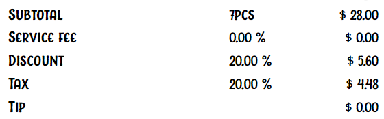
Summary
In the summary layout style, the price calculations of your cart are displayed:
Checkout
In the checkout layout style, the Cart and Summary layouts are combined:
Generic Settings
- Layout style: Change the basic layout of the widget.
- Cart layout type: Choose how items are displayed.
- Split box area: Adjust the height of your cart and summary.
- No items text: Change the placeholder text for an empty cart.
Customization Options
Cart Settings
Modify the visual appearance of your cart, including font family, size, color, and more.
Cart Align Settings
Set the width of each cell in your cart.
Middle Line Settings
Customize the color of the separator line between the Cart and Summary sections if you're using the Checkout layout style.
Summary Settings
Modify the visual appearance of the summary, including font family, size, color, and options for discount, service fee, tax, and tip percentages.
Price Settings
Adjust price display by adding text, currency symbols, spaces, and enabling decimal points.
Quantity Settings
Customize the formatting of quantities, including adding text and spaces before and after.
Percentage Settings
Modify the formatting of percentage-based fields (service fee, discount, tax, tip). You can add text, spaces, and enable decimal points.
Touch Events
You can place other widgets (e.g., text widget) and configure touch events for them to interact with the checkout widget.
Available Touch Events
- Clear cart: Clears all items in the cart.
- Add tip: Adds a tip based on a static value. Choose between percentage or fixed value under Tip type in the widget's summary settings.
- Submit: Adds items in your cart to your order.
- Checkout: Finalizes your order.