Device Analytics
You can reach the Analytics tab by clicking the Analytics button on the horizontal menu.
In the Device Analytics menu you can see hardware, network, and more information about your devices in graphs.
 |
|---|
Or you can open the context menu of a device and select the Screen analytics option.
 |
|---|
Device Metrics
On the analytics interface you can gather information on your screens performance and behavior.
Filtering
In the Filter section you can set filters to show the data you want.
- Administrators can change between Clients and can see other's devices.
Users with a Super Administrator role are able to select from all customers.
Filtering by customer will reduce the options of screens you can choose from.
Users with other roles can only choose screens from the customer they are bound to.
- In the Screens filter you can select the device you want to check.
Selected screens will be added to the Analytics view.
In the selected drop-down you can select multiple screens at once.
- You can also add a Custom time interval.
Device Analytics will only show data from the selected time interval.
 |
|---|
You can either choose from predefined time ranges in the selected drop-down or select the Custom option which will reveal a datapicker interface for more specific filtering.
 |
|---|
-
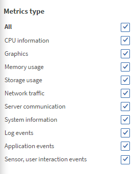
In the Metrics type filter you can select what type of data you want or do not want to see in the analytics.
-
After you set everything you wanted the correct data will appear in graphs.
-
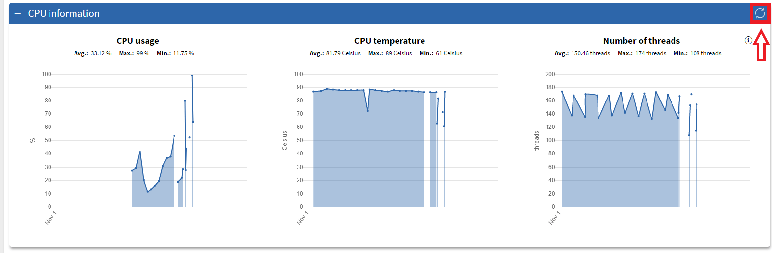
You can refresh data of graphs in each section by pressing the Refresh button.
 |
|---|
Metrics type
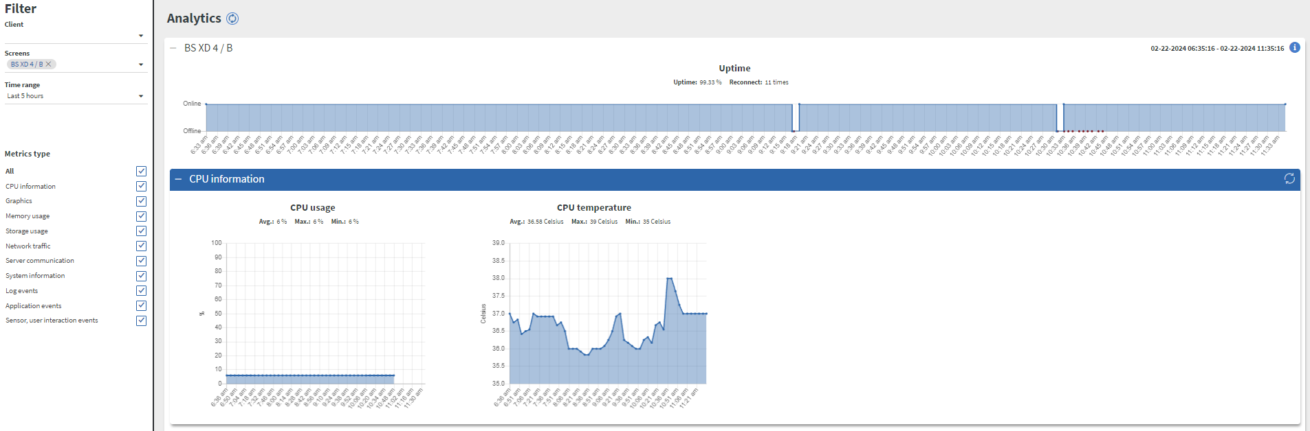
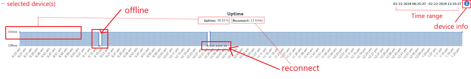
Uptime
- Uptime will always be displayed in Analytics menu.
- This diagram shows whether the selected device(s) was/were
onlineorofflineduring the selected time range. - The red dots indicate
reconnection. If the reconnection was 0 the uptime must be 100%.
 |
|---|
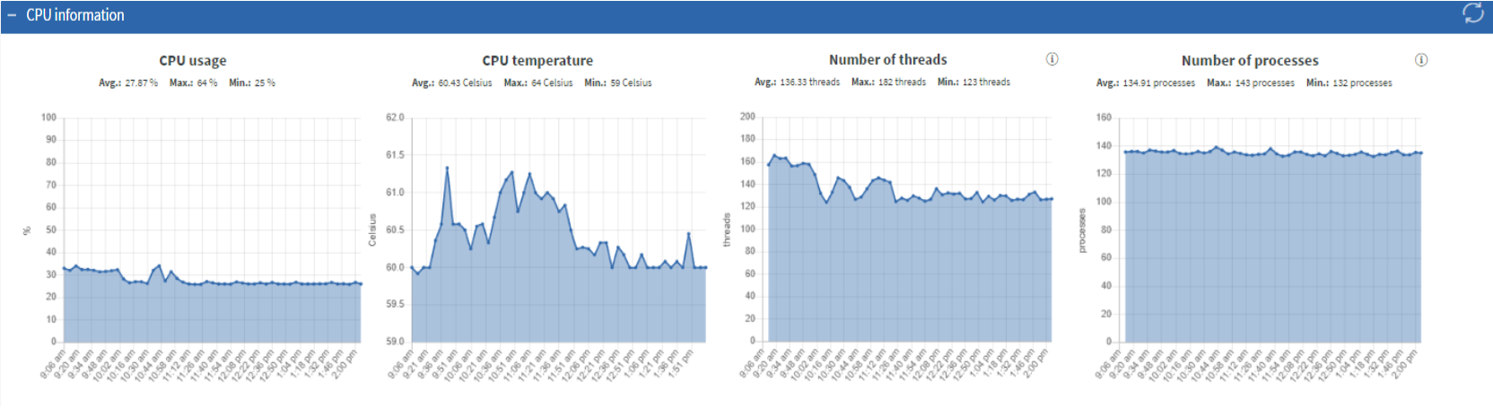
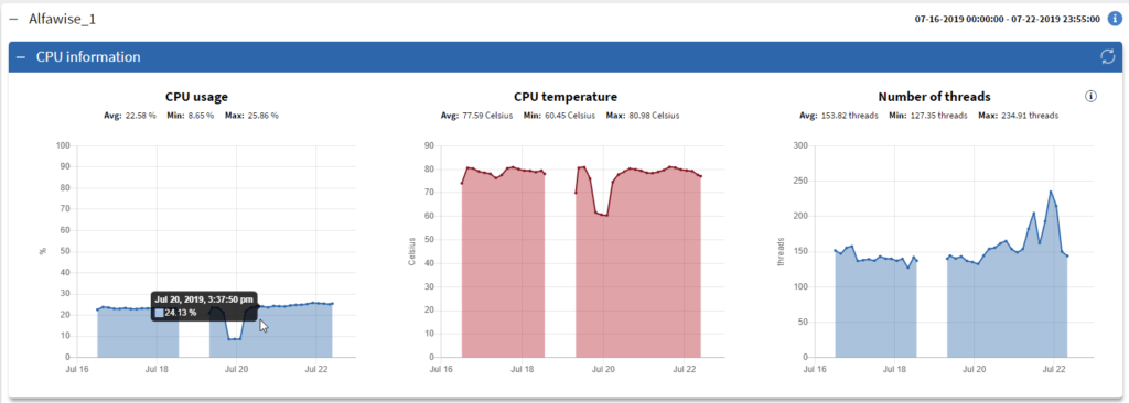
CPU information
- Here you can track
CPU usageandCPU temperature,Number of processesandNumber of Threadsif available with the chosen device.
 |
|---|
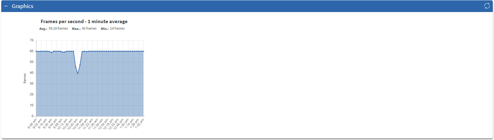
Graphics
- In Graphics you can find an
FPS (frames per second)diagram.
 |
|---|
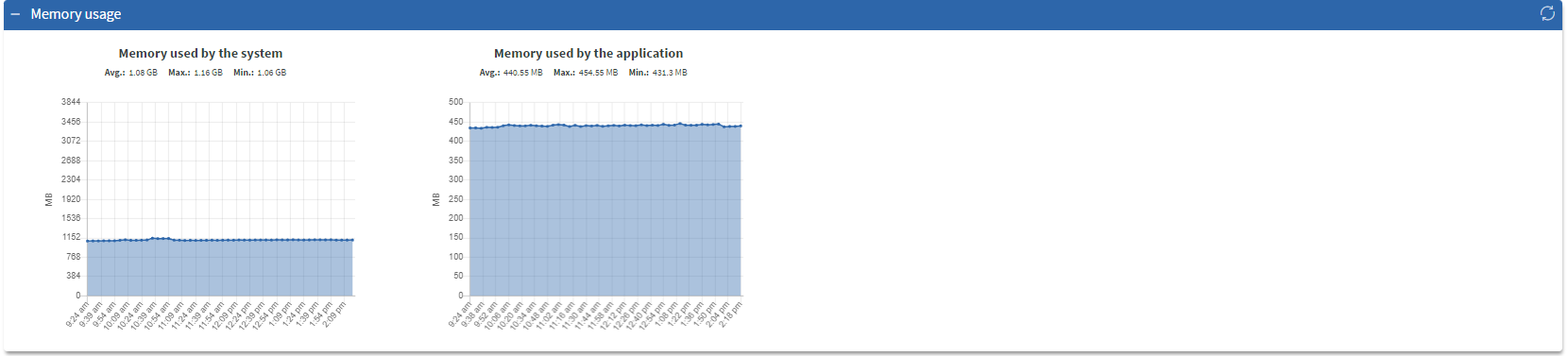
Memory usage
In Memory usage section you can find 2 diagrams: Memory used by the System and Memory used by the application
 |
|---|
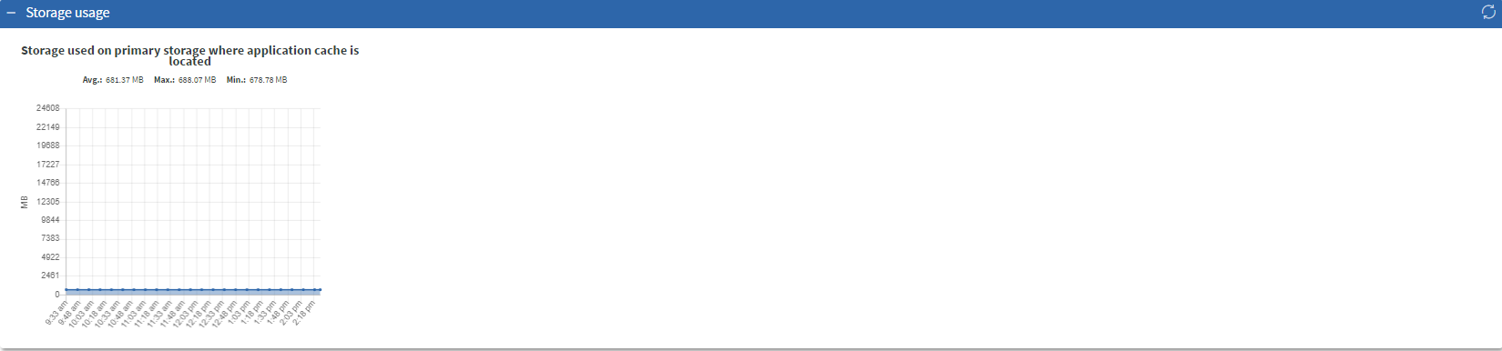
Storage usage
Here you can see the device's primary Storage usage
 |
|---|
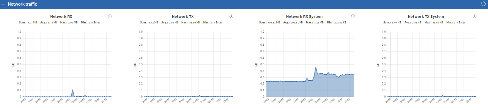
Network Traffic
Here you can check the following things:
Network RX- Amount of network packets received by application.
Network TX - Amount of network packets transmitted by application.
System RX - Amount of network packets received by system.
System TX - Amount of network packets transmitted by system.
 |
|---|
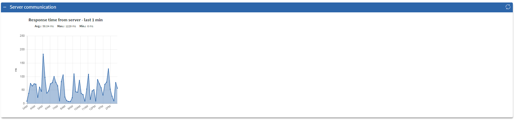
Server communication
Here you can find response time diagrams
 |
|---|
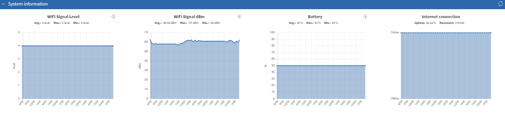
System information
Here you can find information about the system such as:
WiFi signal level - WiFi signal level ranging from 0 to 5.
- If internet is provided via ethernet cable, this value must be 0.
WiFi signal dBm - WiFi signal level ranging in more punctual scale.
-
-30 dBm- Excellent - Max achievable signal strength -
-67 dBm- Very Good - Minimum signal strength for most business applications -
70 dBm- Okay - Minimum signal strength for a decent packet delivery -
80 dBm- Not Good - Minimum signal strength for most basic connectivity. Packet delivery may be unreliable. -
90 dBm- Unusable - Approaching or drowning in the background transmissions and causing serious interference.- If internet is provided via ethernet cable, this value must be 0 dBm.
Battery - Battery level as percentage.
- If device is continuously connected to power, the value must be 50%
- If device uses a battery, percentage will change.
Internet connection - This must be online or offline. Reconnect is indicated with red dots, and each reconnect must be shown in the counter under the title.
 |
|---|
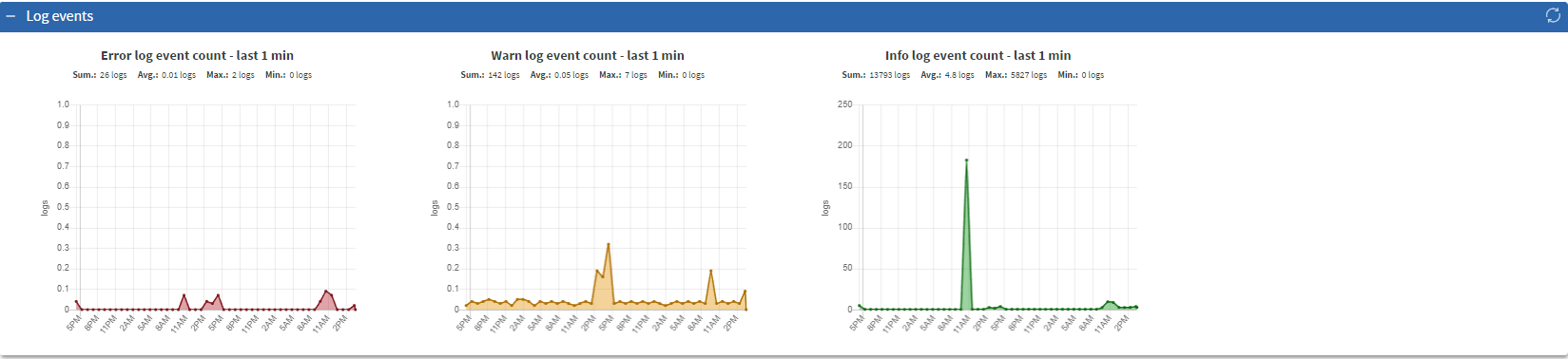
Log events
 |
|---|
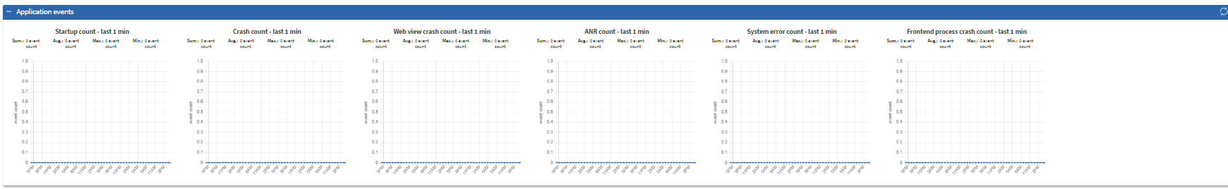
Application events
Here you can see the following metrics:
 |
|---|
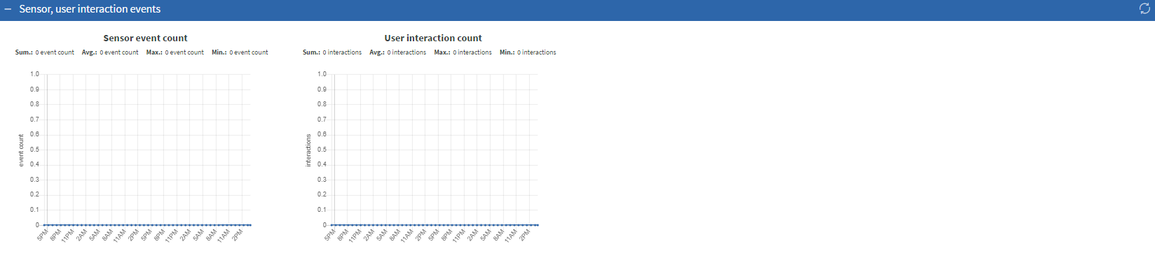
Sensor, user interaction events
Here you can see how many sensor events and click counts happened on the device.
 |
|---|
Analytics view
 |
|---|
- In the Analytics view each device has a collapsible panel containing the metric types and graphs.
- Re-opening panels will refresh graphs just as well as the refresh button.
- Points in graphs represent an average based on the size of the time range.
- Shorter time intervals will provide more accurate metrics.
- Graphs display an overall average, maximum, minimum, and summarized value.
No data intervals
 |
|---|
- Gaps will appear in the graphs if there are intervals where the device did not upload data.
- This can either mean the device was offline or a malfunction happened when collecting or uploading the data.
Graph coloring
Some graphs have an initial color for better understanding.
- error log count - red
- warn log count - yellow
- info log count - green
Warning limits on specific metrics:
- cpu usage
- warn limit: average value is above 70 %
- error limit: average value is above 85 %
- cpu temperature
- warn limit: average value is above 60 °C
- error limit: average value is above 75 °C
- frames per second
- warn limit: average value is under 30 fps
- error limit: average value is under 24 fps
- memory used by the system
- warn limit: average value is above 70 % of the memory
- error limit: average value is above 85 % of the memory
- used storage
- warn limit: average value is above 70 % of the storage space
- error limit: average value is above 85 % of the storage space
- server response time
- warn limit: average value is above 100 ms
- error limit: average value is above 300 ms