Settings - Branding
Branding lets you define reusable brand kits for your customer. Each brand kit bundles a set of logos, a color palette, and typography, so you can keep content consistent with your visual identity and re-skin content by switching kits.
Accessing Branding
Branding has its own Branding tab in your customer settings. The Branding page lists every brand kit defined under your customer.
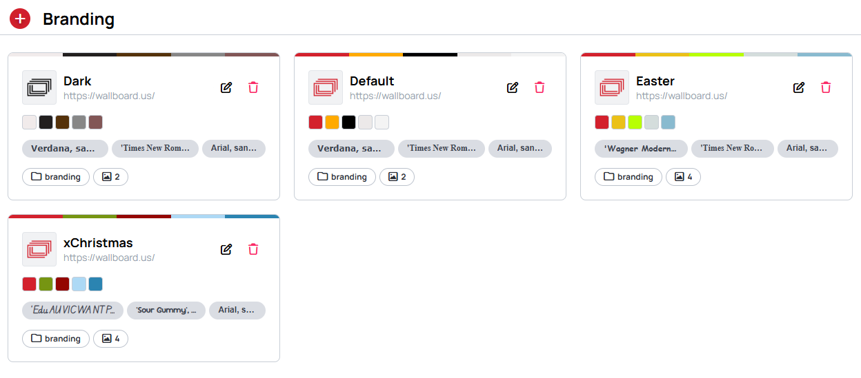
Each brand kit card shows its name, company URL, color palette, fonts, the linked logo folder, and the number of logo images it contains.
- + (top-left) — create a new brand kit
- Pencil icon — open the brand kit for editing
- Trash icon — delete the brand kit
You can create multiple brand kits under a single customer — for example, to support different sub-brands or seasonal campaigns.
Editing a brand kit
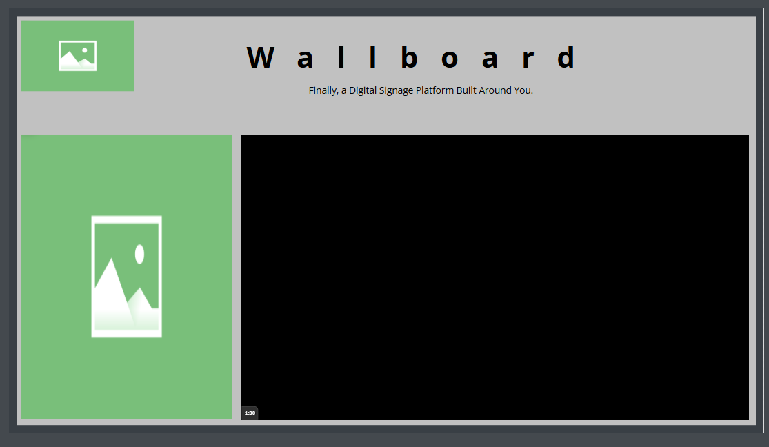
Opening a brand kit shows a full-screen editor: the configuration is on the left, and a live Preview on the right updates as you change logos, colors, and fonts, so you can see your branding applied to a sample piece of content while you edit.
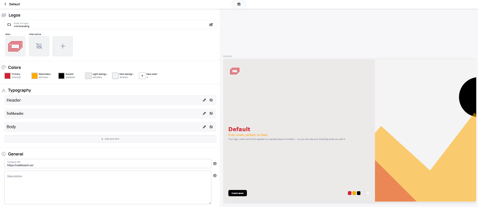
A brand kit is made up of four sections: Logos, Colors, Typography, and General.
Logos
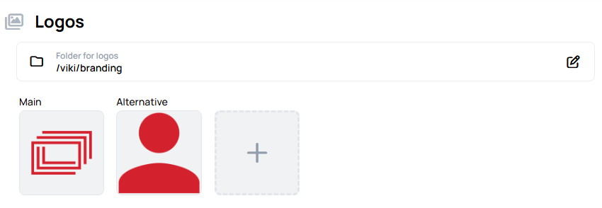
- Folder for logos — select a folder from the Files menu to hold the kit's logo images. Use the edit icon to change the folder.
- Main and Alternative — two default logo slots for different use cases.
- + — add additional (custom) logo slots.
When a folder is selected as a brand kit's logo folder, it is marked with a branding icon in the Files menu. This is only a visual indicator — it does not otherwise change how the folder behaves or restrict its use.

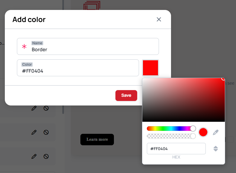
Colors
A brand kit has five default color slots that cannot be removed: Primary, Secondary, Accent, Light background, and Dark background.
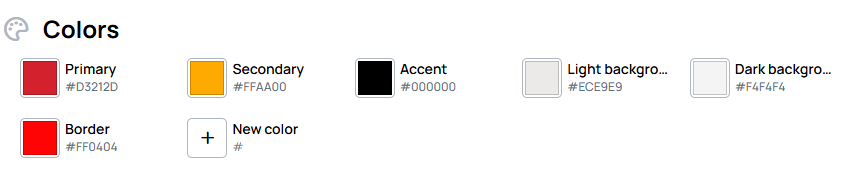
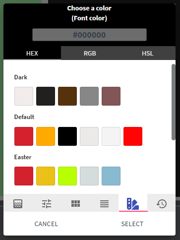
To add a custom color, click + New color, give it a name, and set the value with a hex code or the color picker.
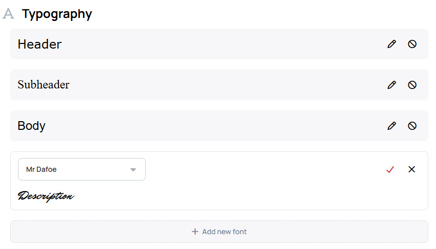
Typography
A brand kit has three default font slots that cannot be removed: Header, Subheader, and Body. Edit a slot with its pencil icon.
To add a custom font, click + Add new font and choose a font family — a preview of the selected font is shown before you confirm.
General
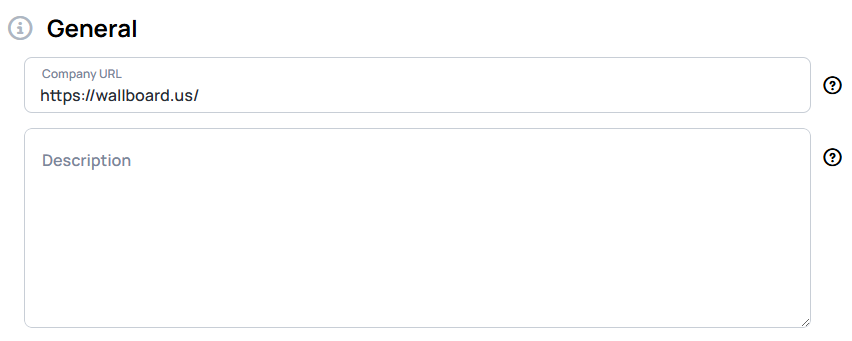
- Company URL — the website associated with the brand kit.
- Description — a short description to identify the brand kit and its purpose.
Read-only users can view brand kits but cannot edit Branding.
Using a brand kit in content
There are two ways to bring a brand kit into your content:
- Bind widget properties to the brand kit's default slots, so the styling can be switched per kit in the Quick editor.
- Pick a brand kit's colors and fonts directly while designing.
Binding widget properties to brand slots
In the content designer, a template author can bind a supported widget property to a brand slot rather than a fixed value. Only the default slots can be bound, and only on these properties:
| Widget | Property | Available brand slots |
|---|---|---|
| Image | Source | Main, Alternative |
| Text | Font family | Header, Subheader, Body |
| Text | Font color | Primary, Secondary, Accent, Light Background, Dark Background |
| Shape | Fill / Stroke (and gradient) | Primary, Secondary, Accent, Light Background, Dark Background |
A brand binding lives in the widget's Quick edit metadata, so the same property must also be enabled for Quick edit for the binding to take effect. Binding a property does not change how the widget looks in the designer — the brand values are resolved later, when a kit is applied in the Quick editor.
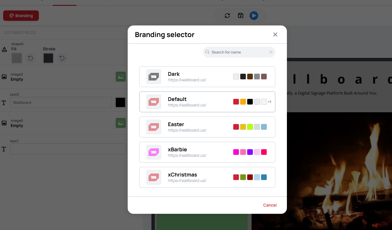
Applying a brand kit in the Quick editor
When a content has brand bindings, a Branding button appears in the Quick editor. In the designer the bound widgets keep their original look:
Click Branding to open the Branding selector and choose a kit. Selecting a kit completes the choice, but it is not applied until you apply it.
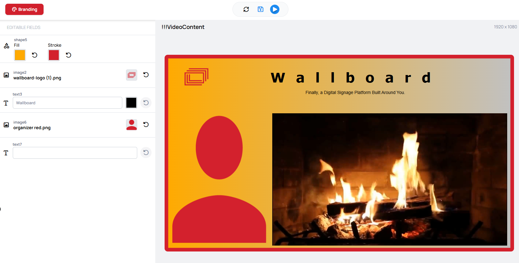
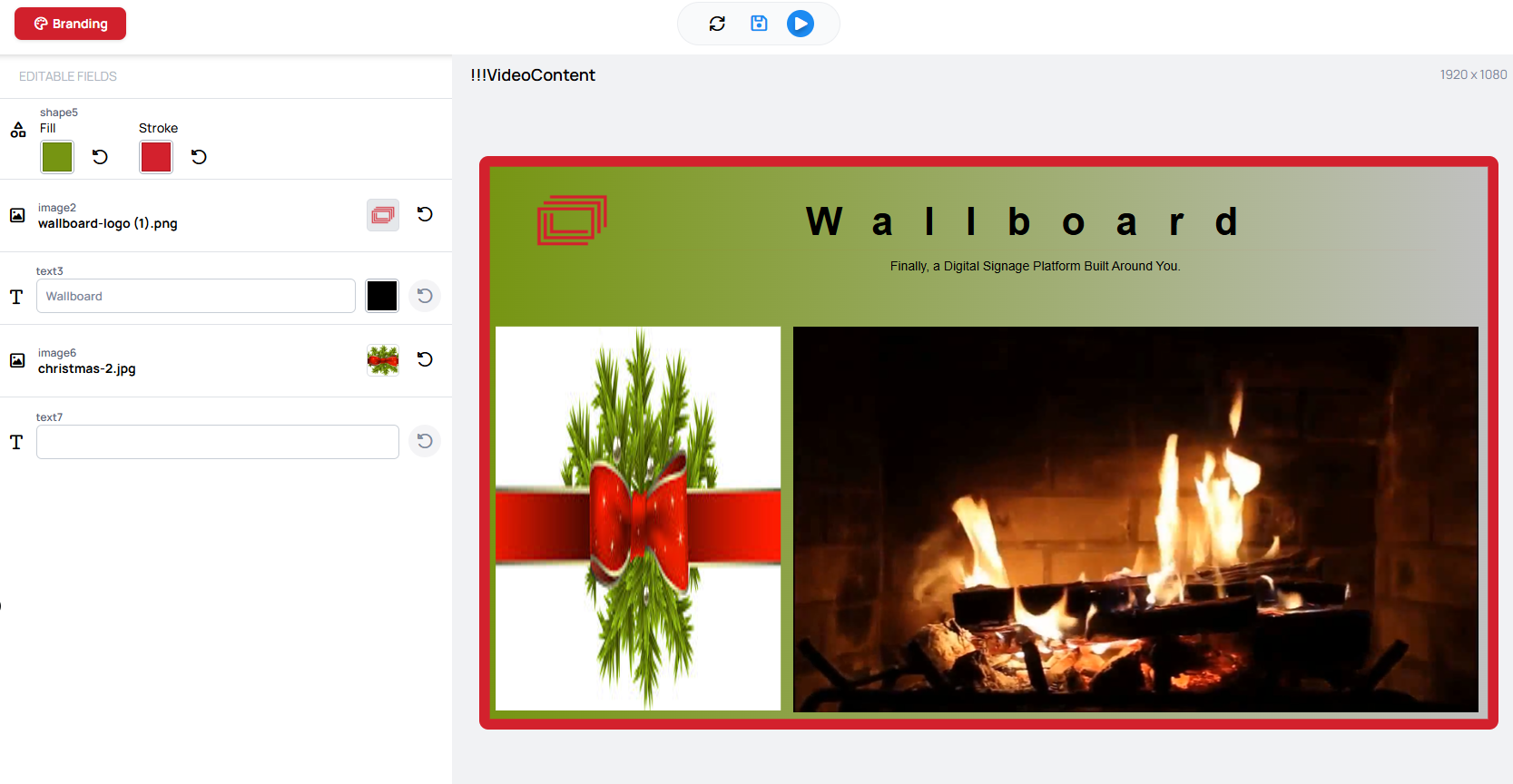
Once applied, each bound slot resolves to a concrete value — colors become color values, fonts become font values, and logos become the corresponding image. Switching to a different kit re-skins the same content:
 |  |
|---|
Applying a kit writes the resolved values into the content as normal widget overrides. There is no separate branding behavior on the player — the device shows the content with those values baked in.
Learn more: Quick Editor
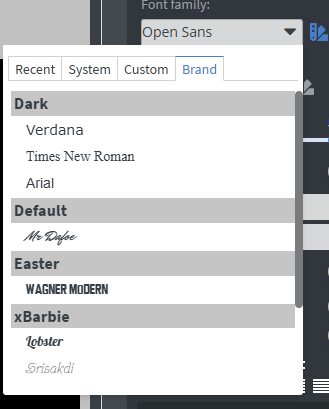
Using brand colors and fonts directly
Custom colors and fonts (the ones beyond the default slots) cannot be bound to Quick edit. You can still apply any brand kit's colors and fonts directly to a widget in the designer:
- The font family picker has a Brand tab that groups the available fonts by brand kit.
- The color picker has a brand palette tab that groups the available colors by brand kit.
 |  |
|---|
Need Help?
Contact us at [email protected] or [email protected]